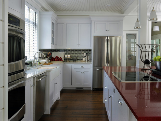
Transitional Kitchen Design
 In the design community, contemporary style and European influence has seemingly taken over in the past 10 years or so. Hard lines and angles have been used with cold materials and colors to accomplish an almost naked look. This commercial style was not only being designed for offices and public spaces, but also private homes. However, recently I've been noticing a surge of warmth showing itself in mainstream design. For so long, I think people were missing a very important part of how a home should feel... comfortable.
Now, those same people are thoughtfully embracing color and softness into their spaces. The outcome? A transitional style that meets traditional and contemporary in the middle. The overly intricate details of a traditional style have been toned down while the colors and textures have been enhanced. The clean lines of contemporary designs have still been embraced, however, the materials and textiles used are warming up the look. And, of course, no design trend can change without affecting the kitchen design field!  For example, with HGTV's 2010 Green Home came a refreshing dose of transitional design. The kitchen flaunts beautiful framed inset cabinetry with great vintage cup pulls, which is all quite traditional looking. However, the doors are simplified by their shaker style and crisp white finish while the cup pulls tie in with the new (and modern!) stainless steel appliances. The warmth of the wood flooring makes for a perfect contrast with the red quartz island countertop. The chunky crown moulding with its' simplified profile meets the traditional bead board ceiling seamlessly. All of this, along with many other details, lends itself to the comfortable and fresh feeling style that is Transitional Design.
What are your thoughts on this design style?
~Bethany~


 Kitchen and Bath Details