


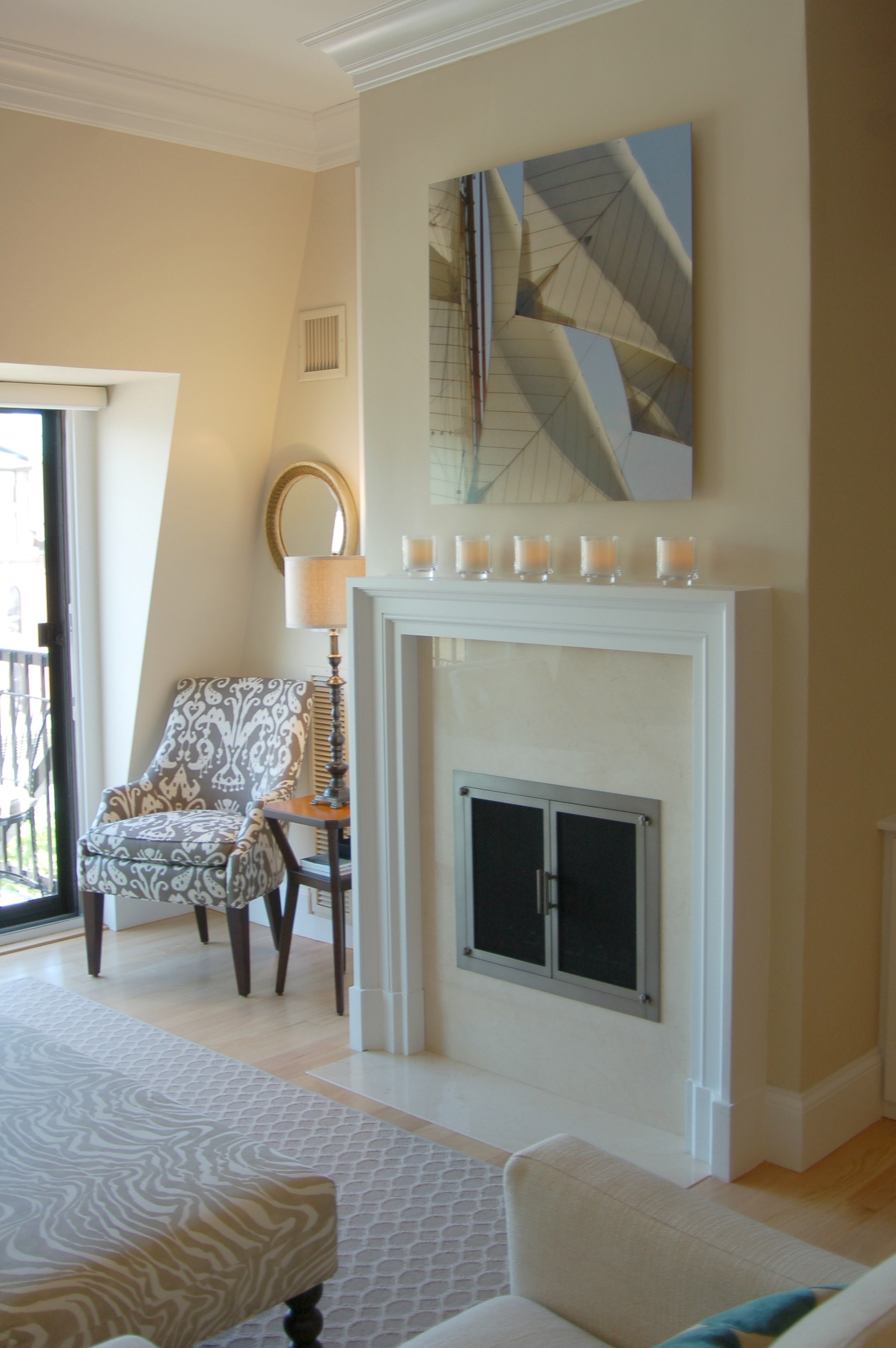
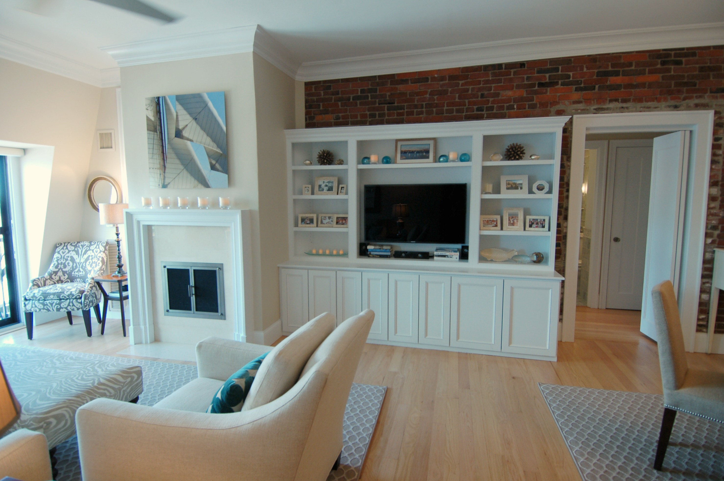
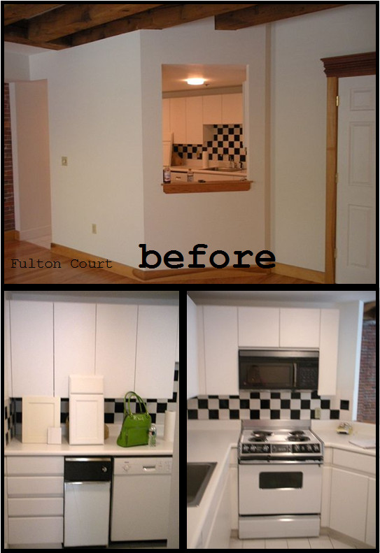
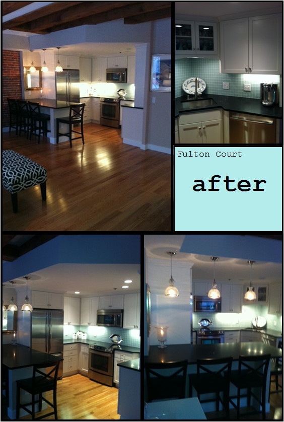
Luxe Lewis Wharf
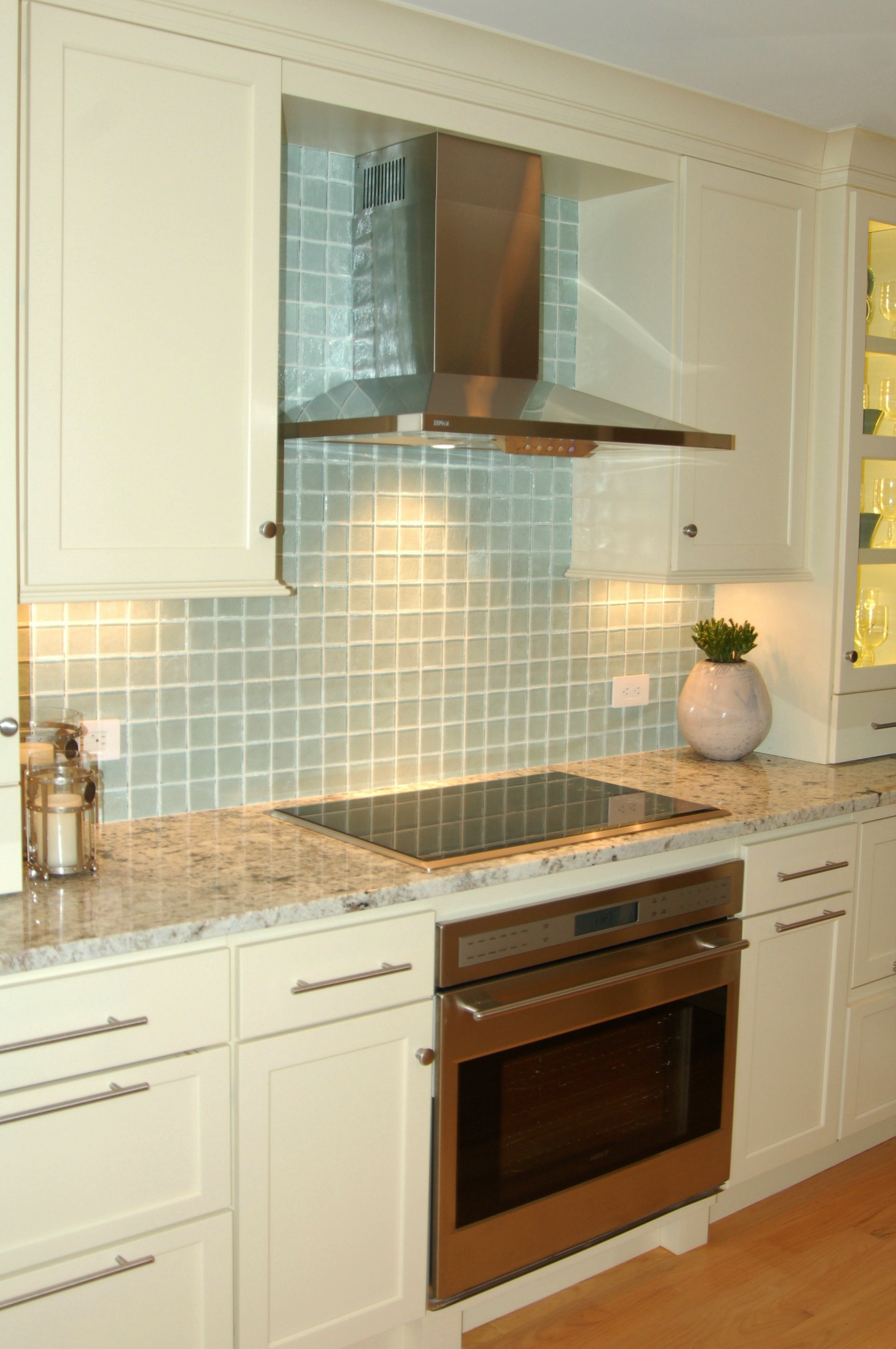
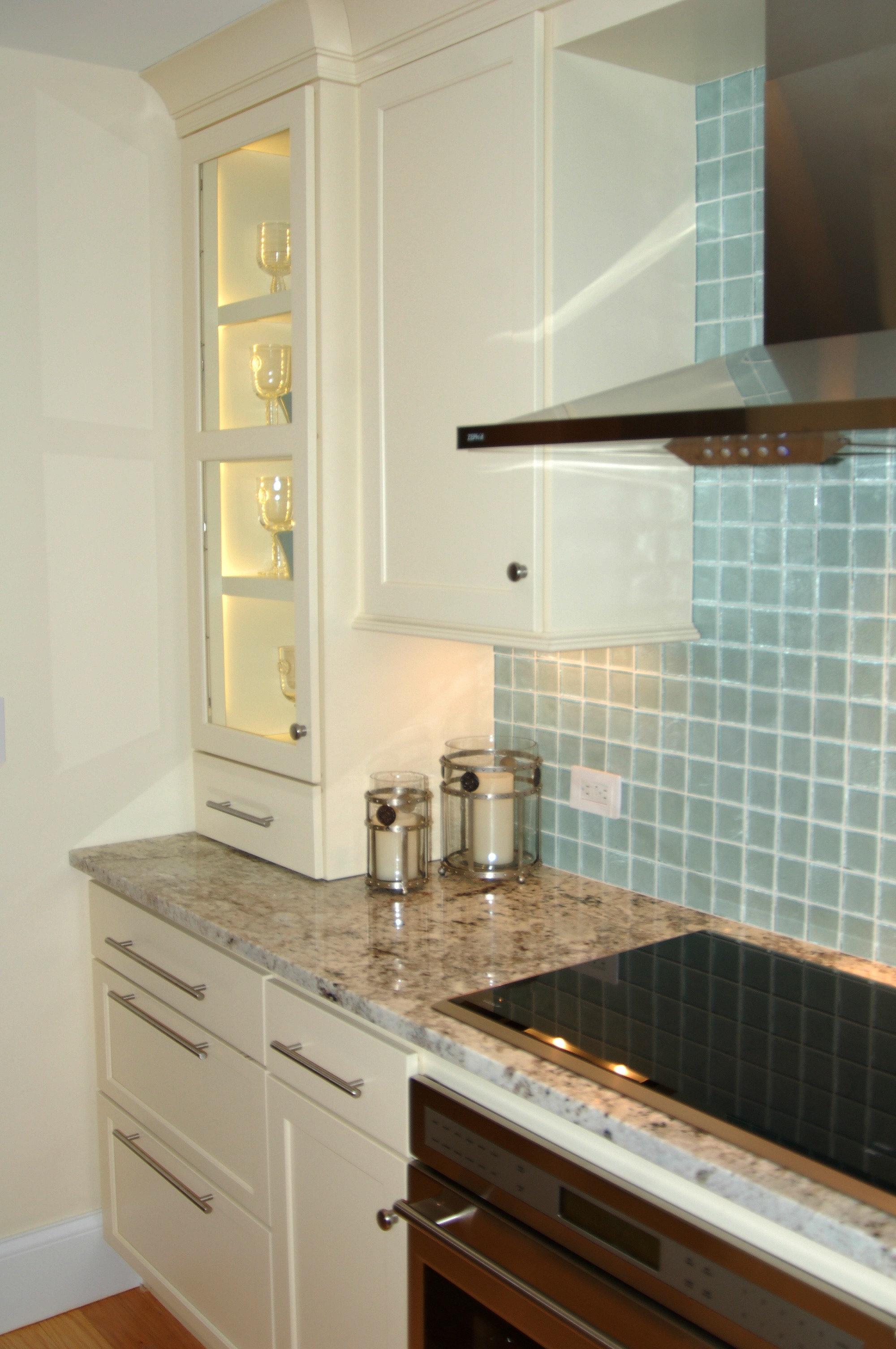
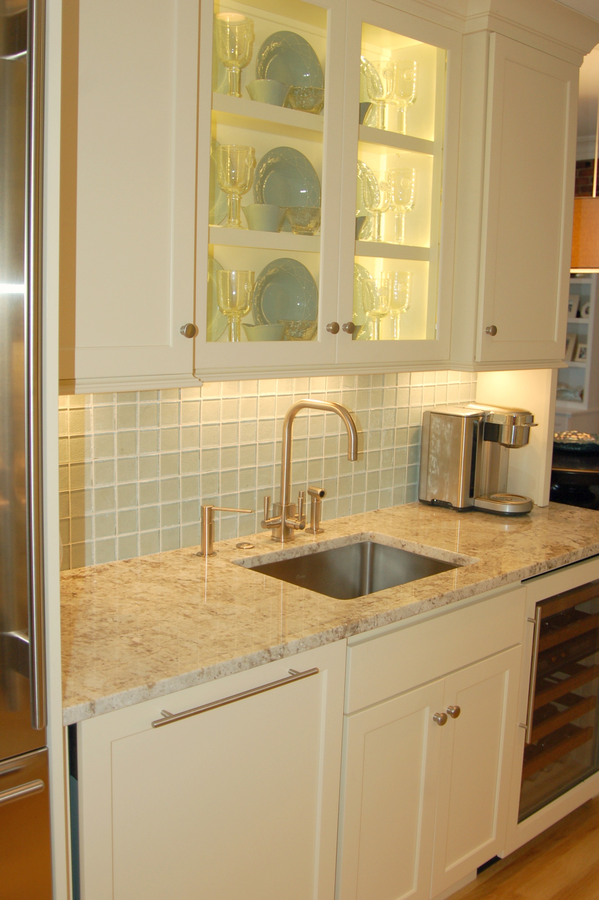
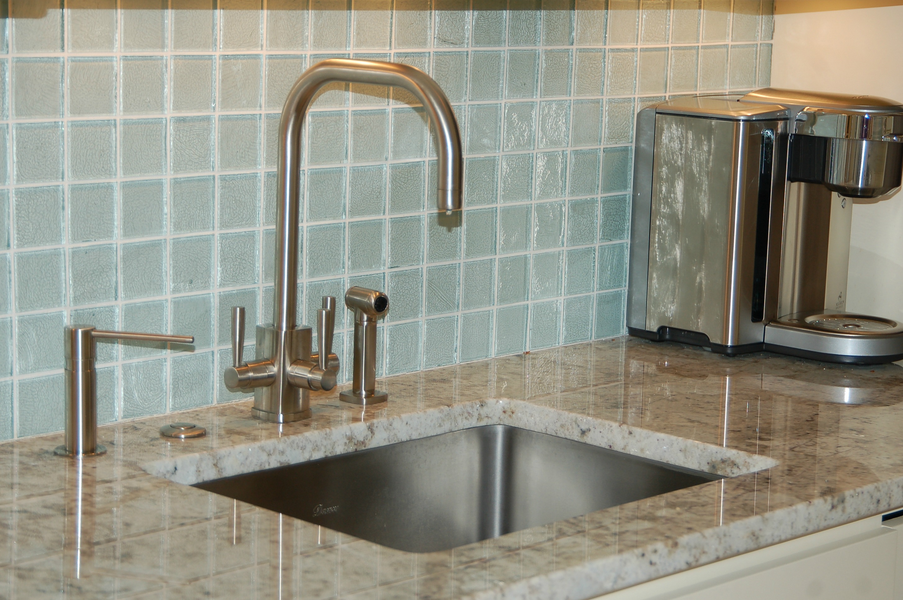
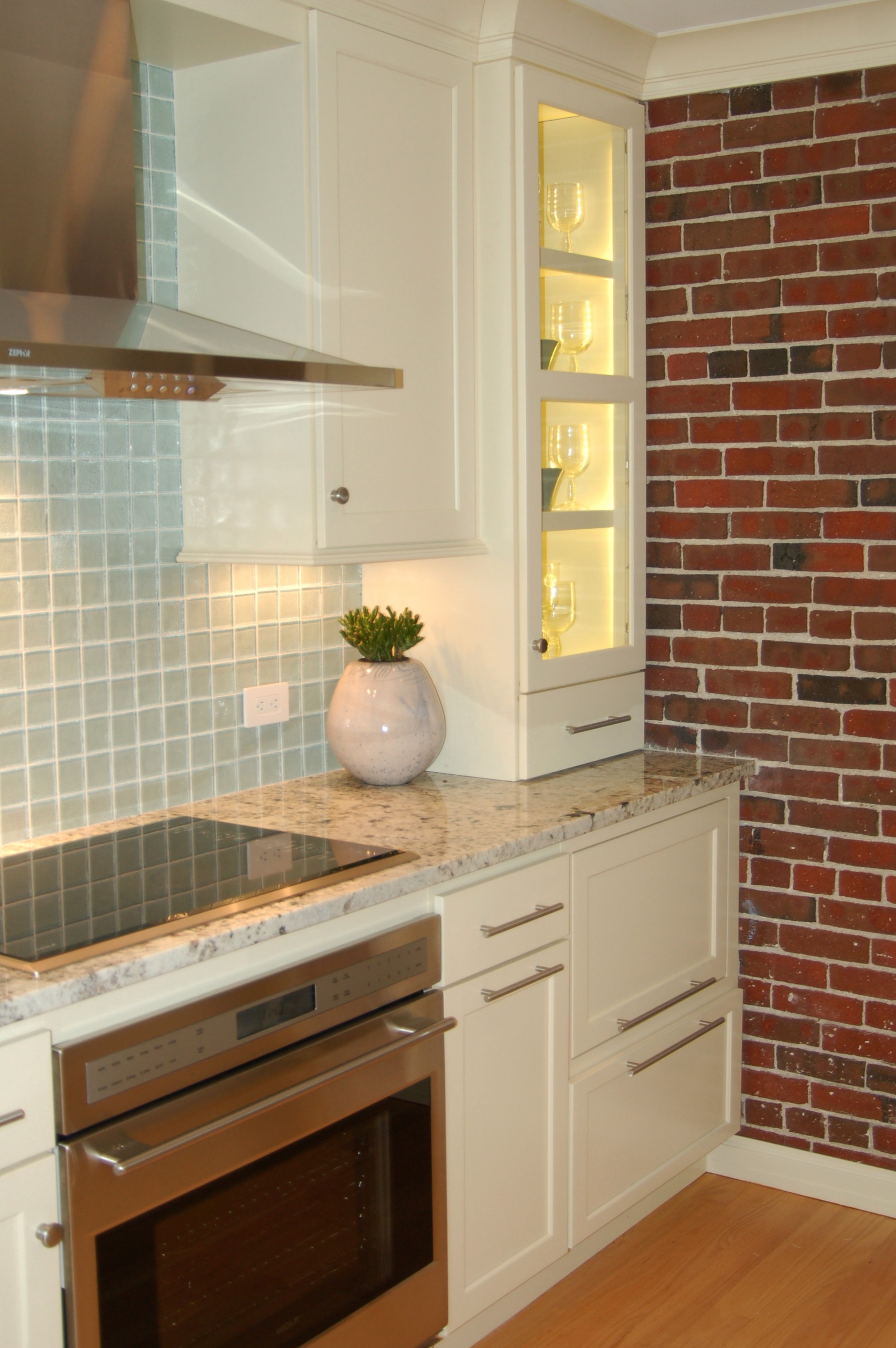
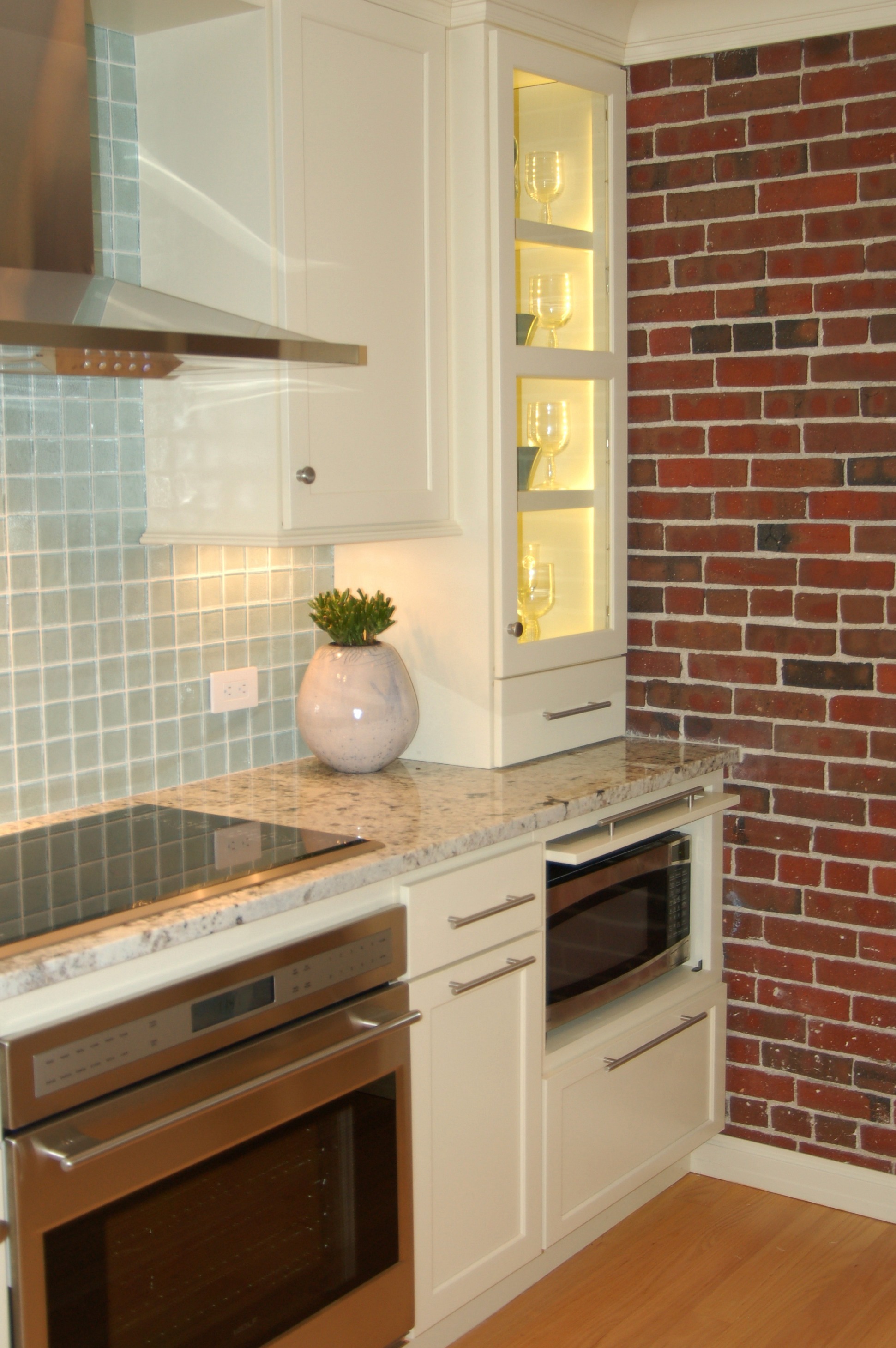
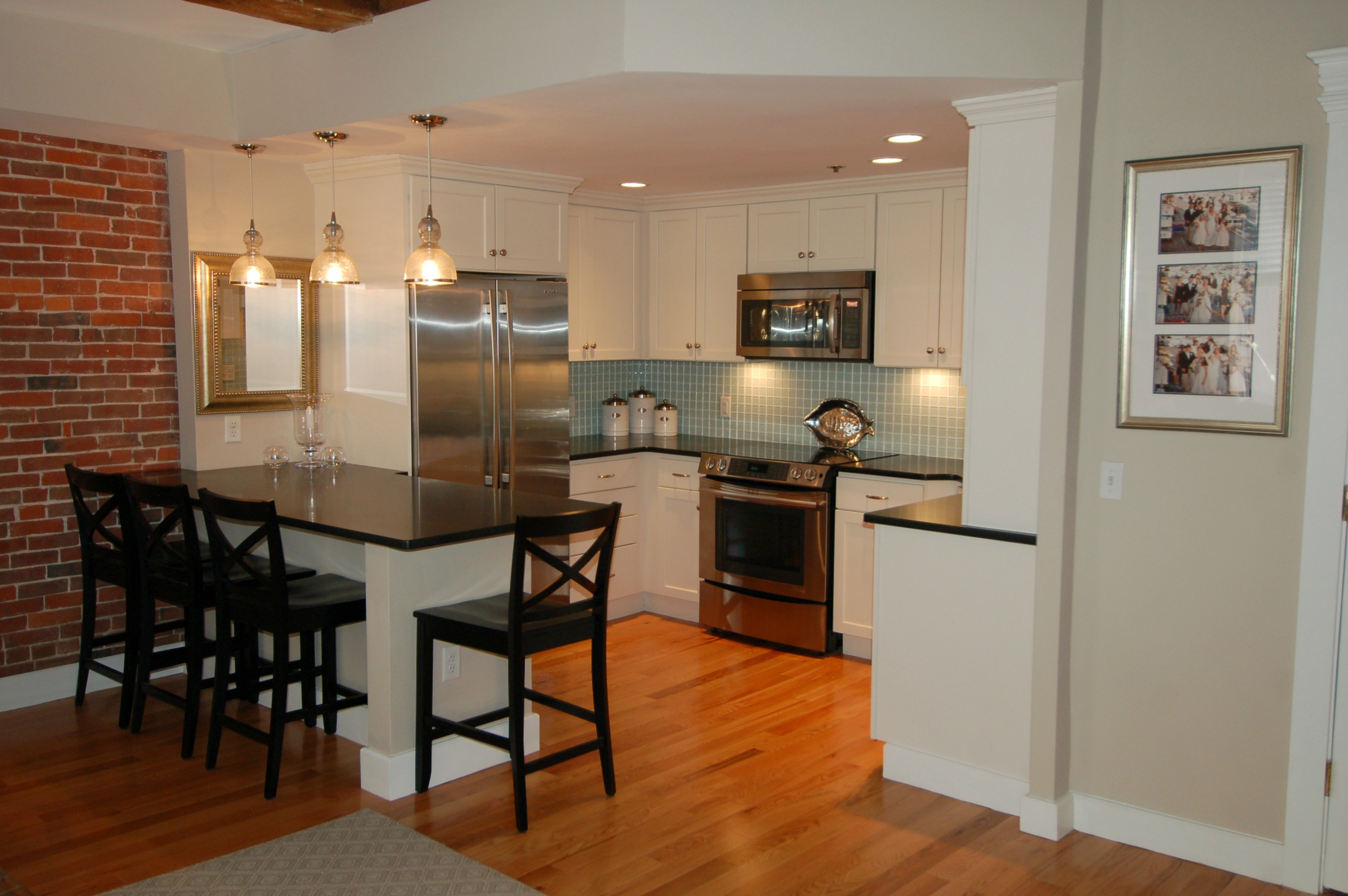
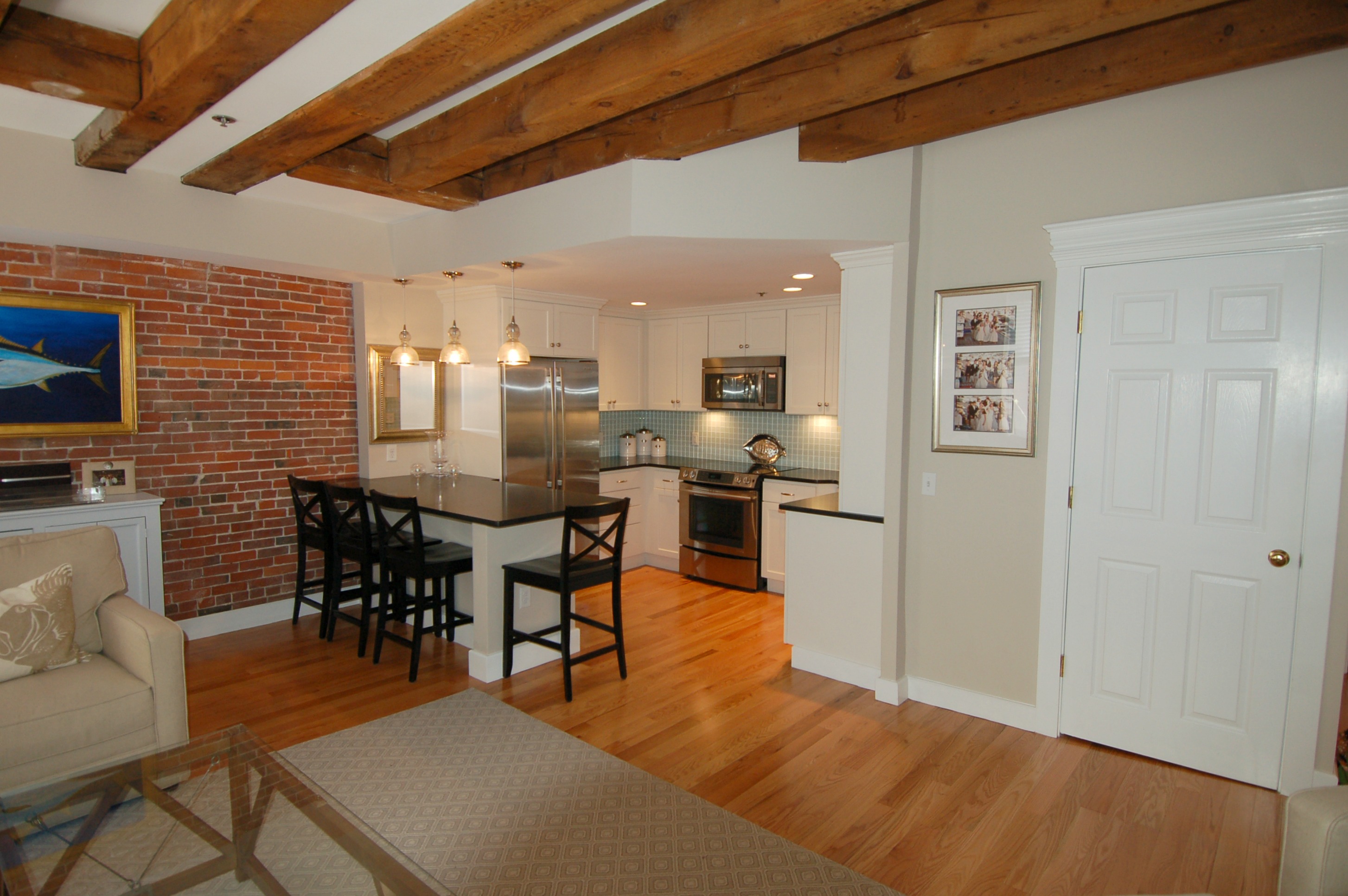
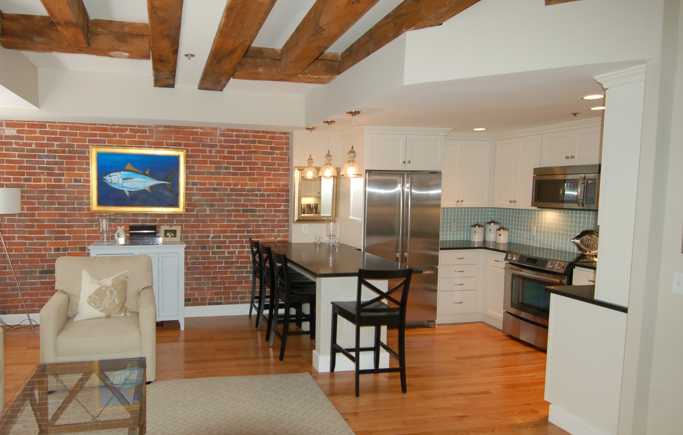
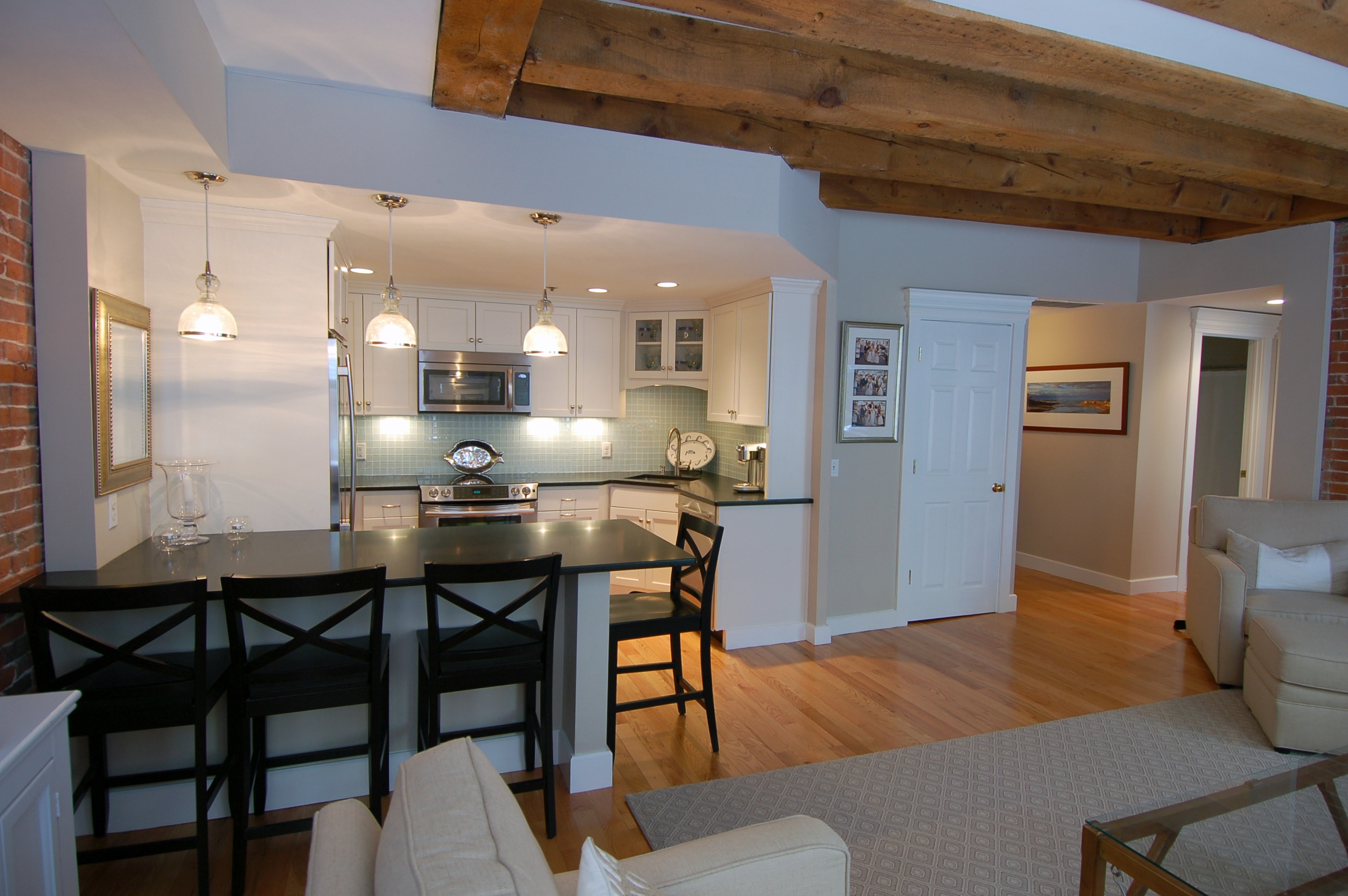
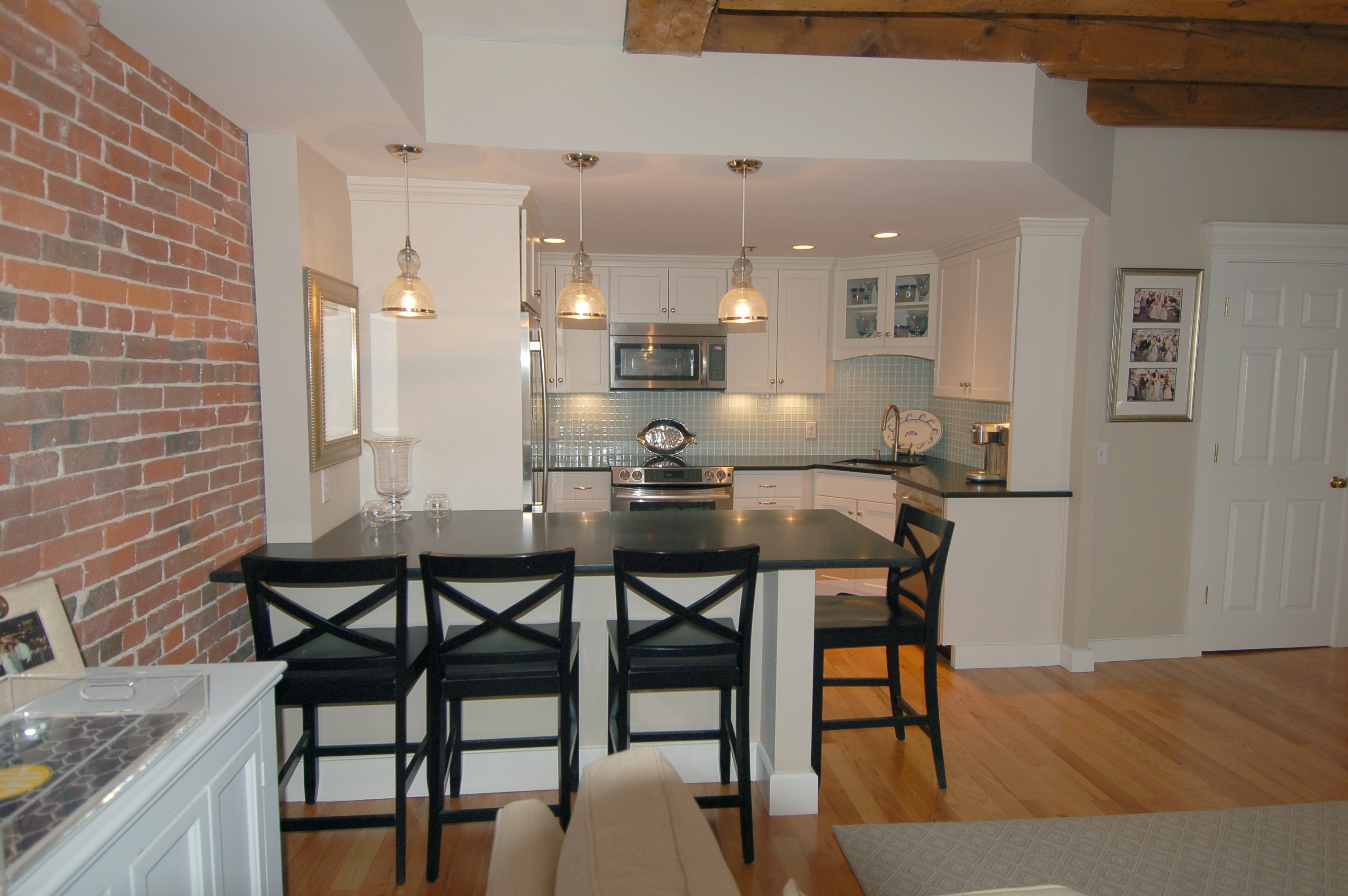
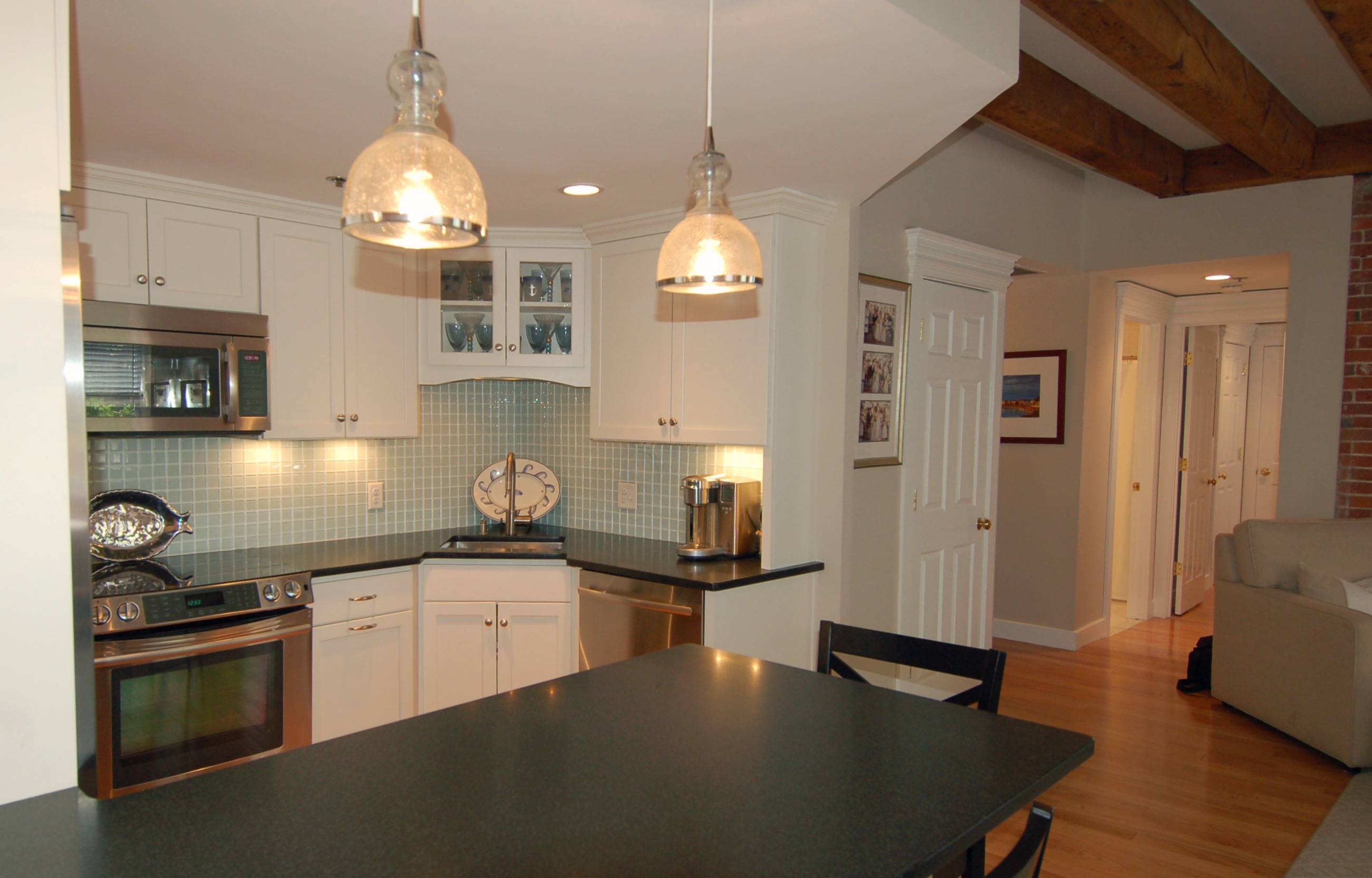
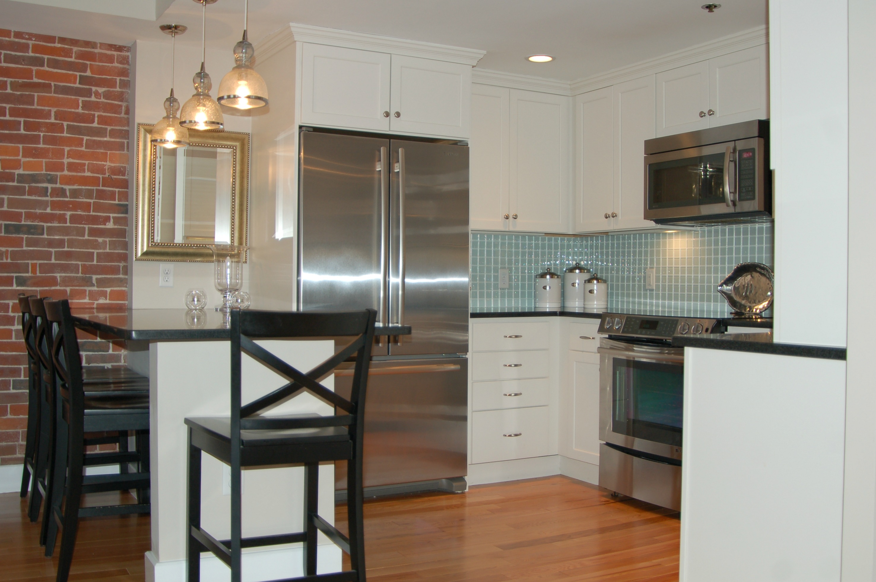
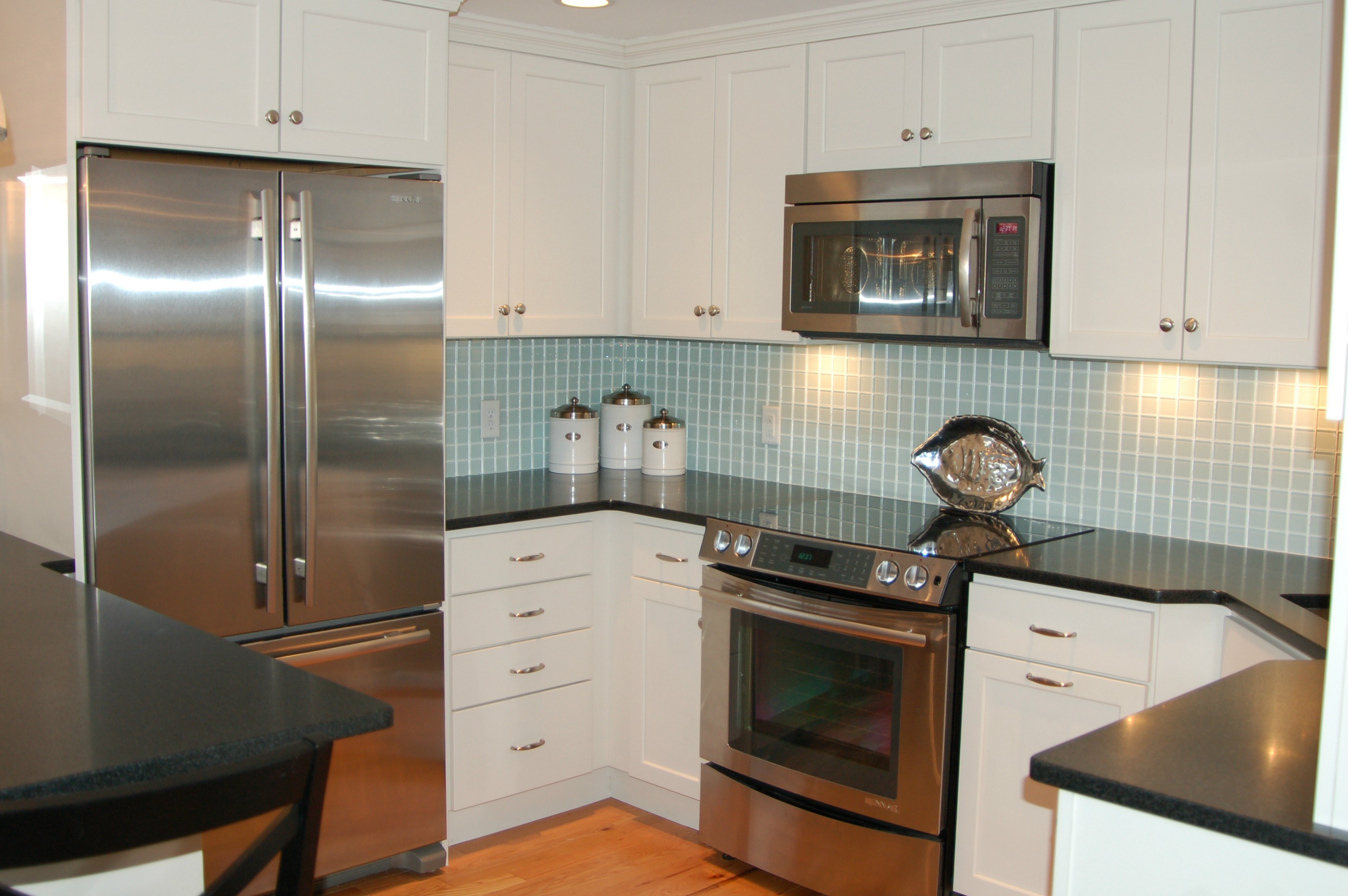
We were so excited to take a job up at Lewis Wharf in the North End of Boston. What an amazing location! We worked with our client a few years back on their kitchen remodel in Cohasset, so we were very familiar with their style and wants/needs. Because this remodel was in the city, our client decided to stray from the norm and add a little urban twist to this space. We are so pleased with the way everything turned out and our client is as well, which is even more important!
Recent message from our Lewis Wharf client:
"Our kitchen turned out even more amazing than we anticipated!!! The first thing we do when we enter our apartment is turn on the under cabinet and glass cabinet lighting in the kitchen . . . and Voila!!! All of your help in choosing the cabinetry, hardware, appliances, countertops . . . right down to the "Details" . . . was invaluable!!! The master bath is a dream to use! Thank you for all of your advice and guidance!!!"
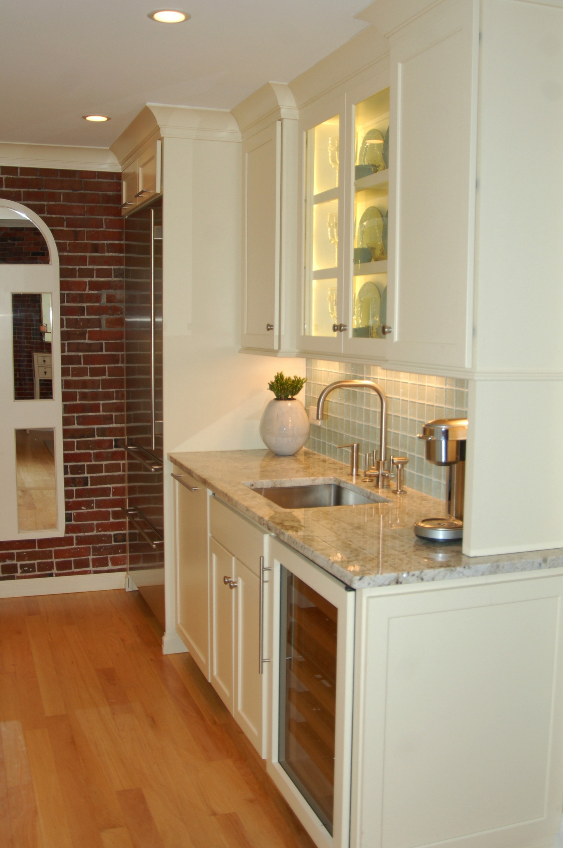
Tena's Design Objective: To provide my client with a compact yet comfortable space for entertaining. This space needed to reflect my Client’s impeccable taste while at the same time maintaining the original characteristics of this antique building’s Boston roots. This project was so much fun! I am very grateful to have been given this wonderful opportunity.
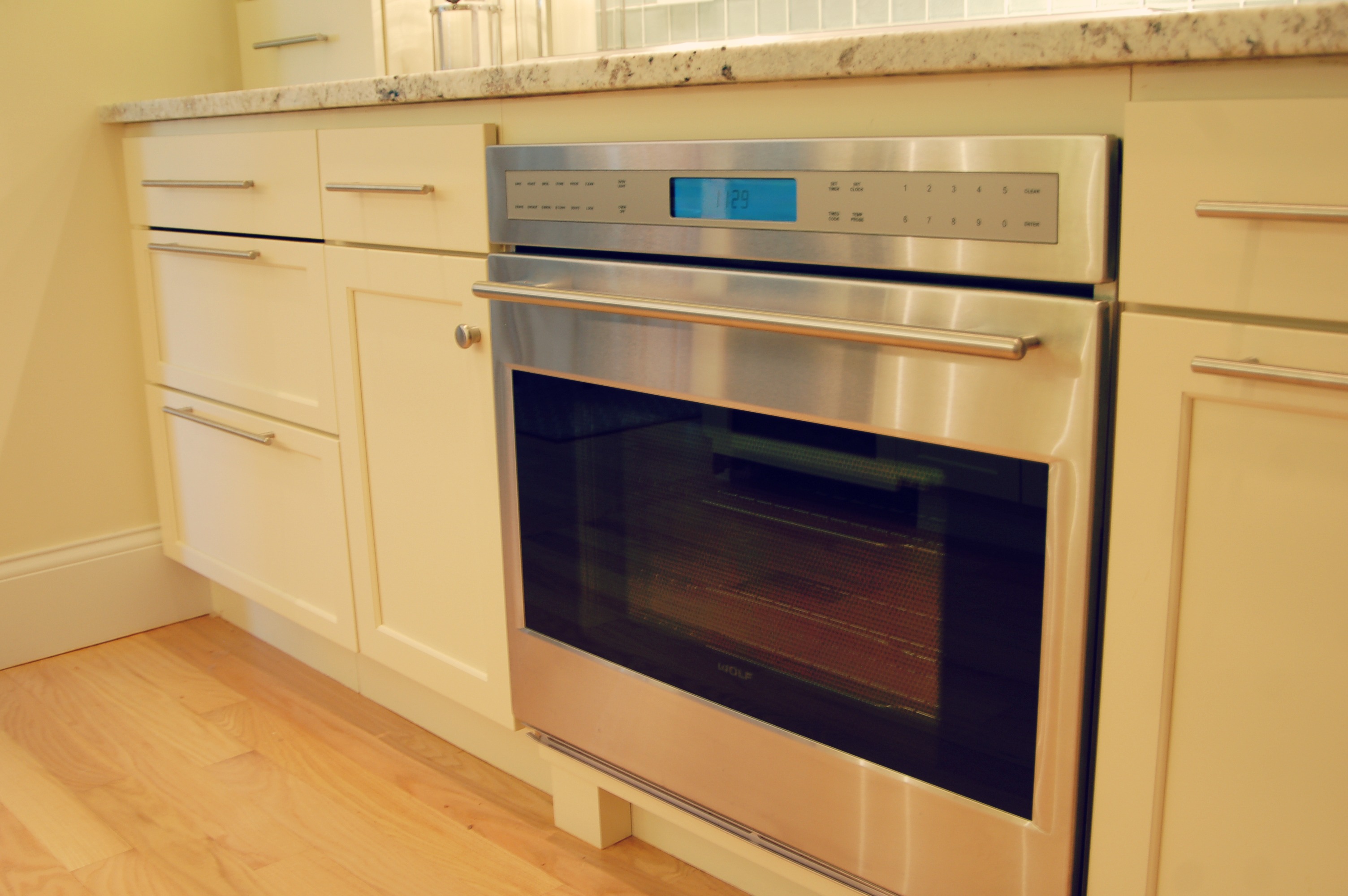
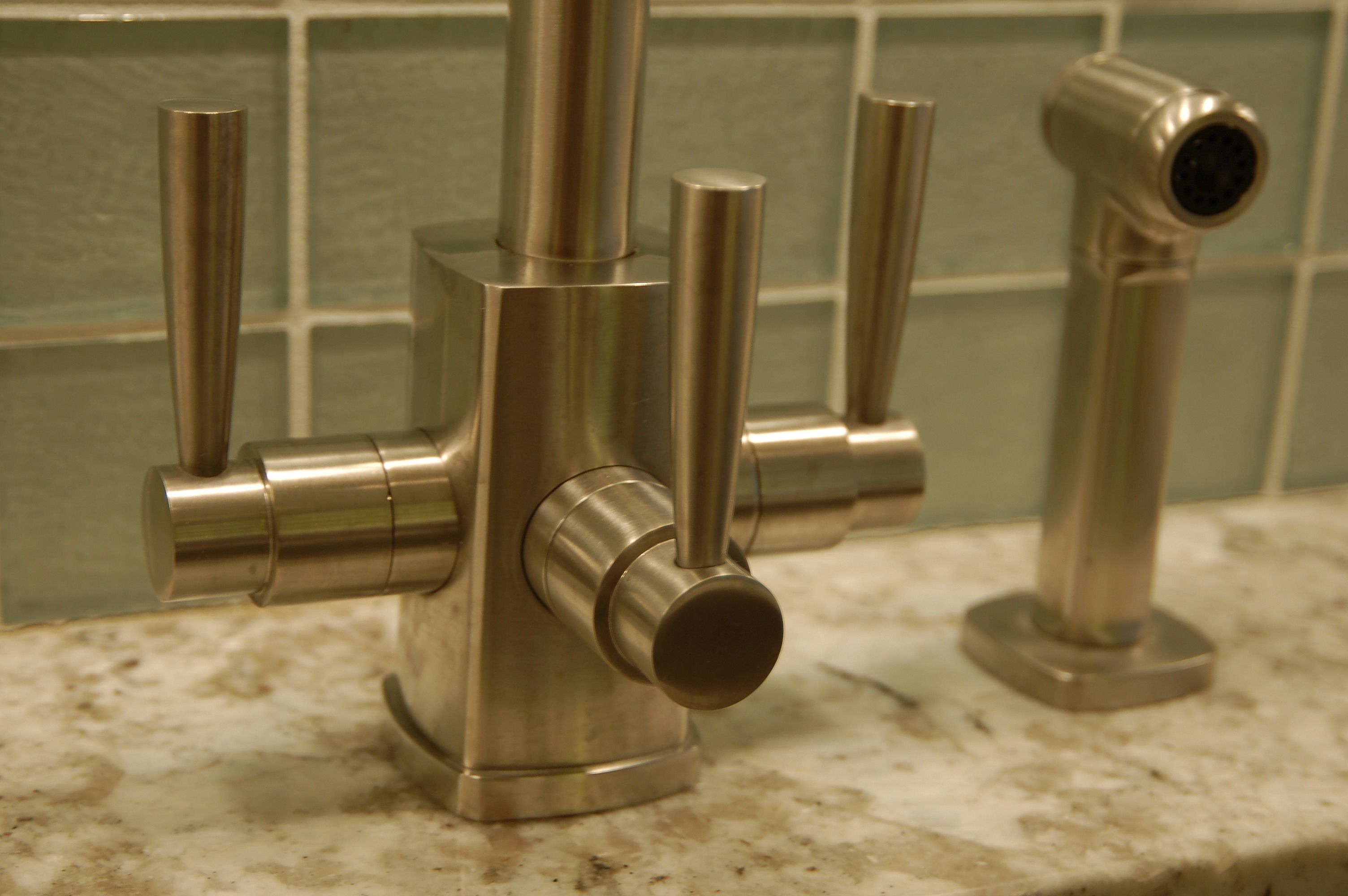
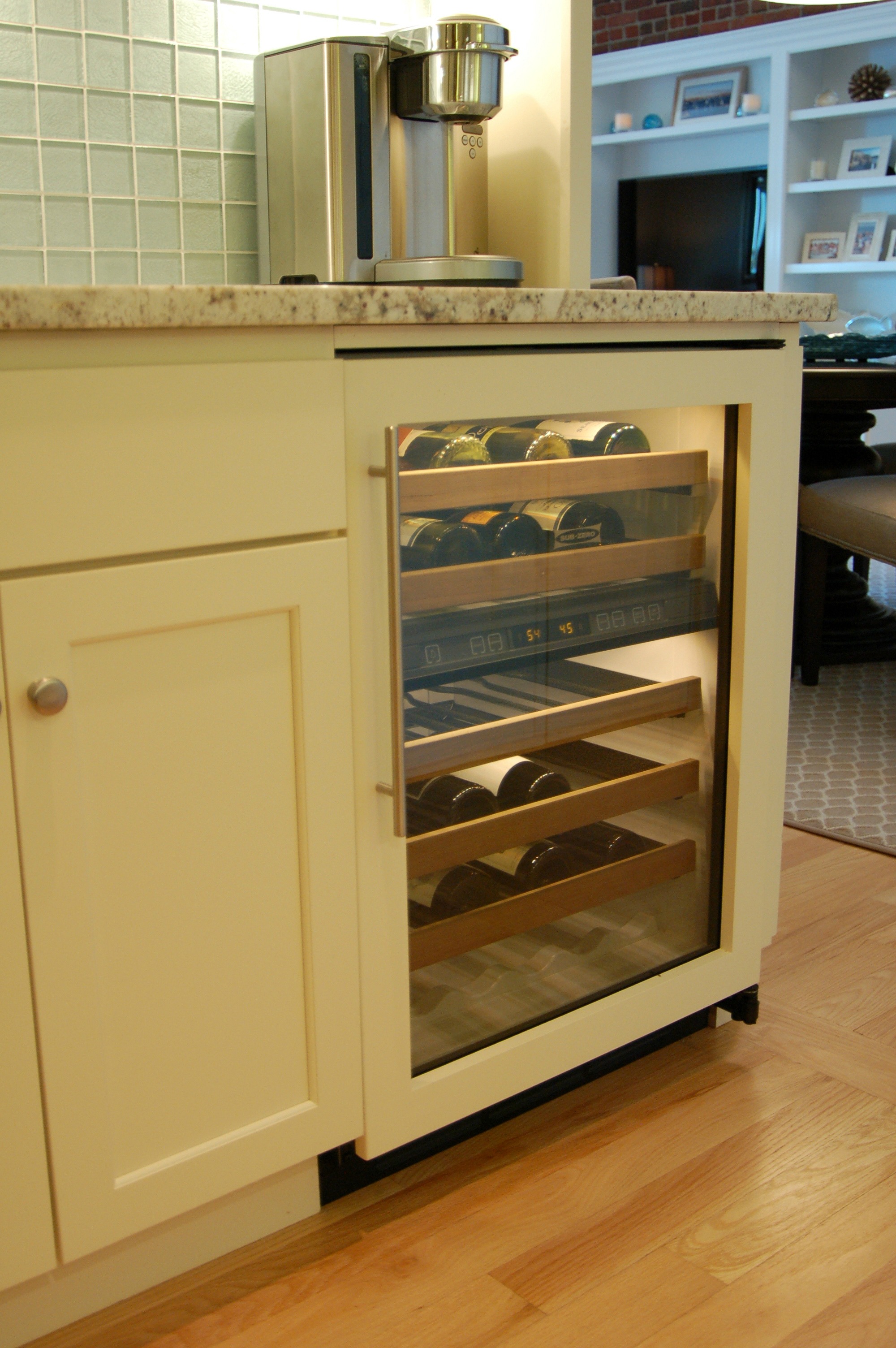
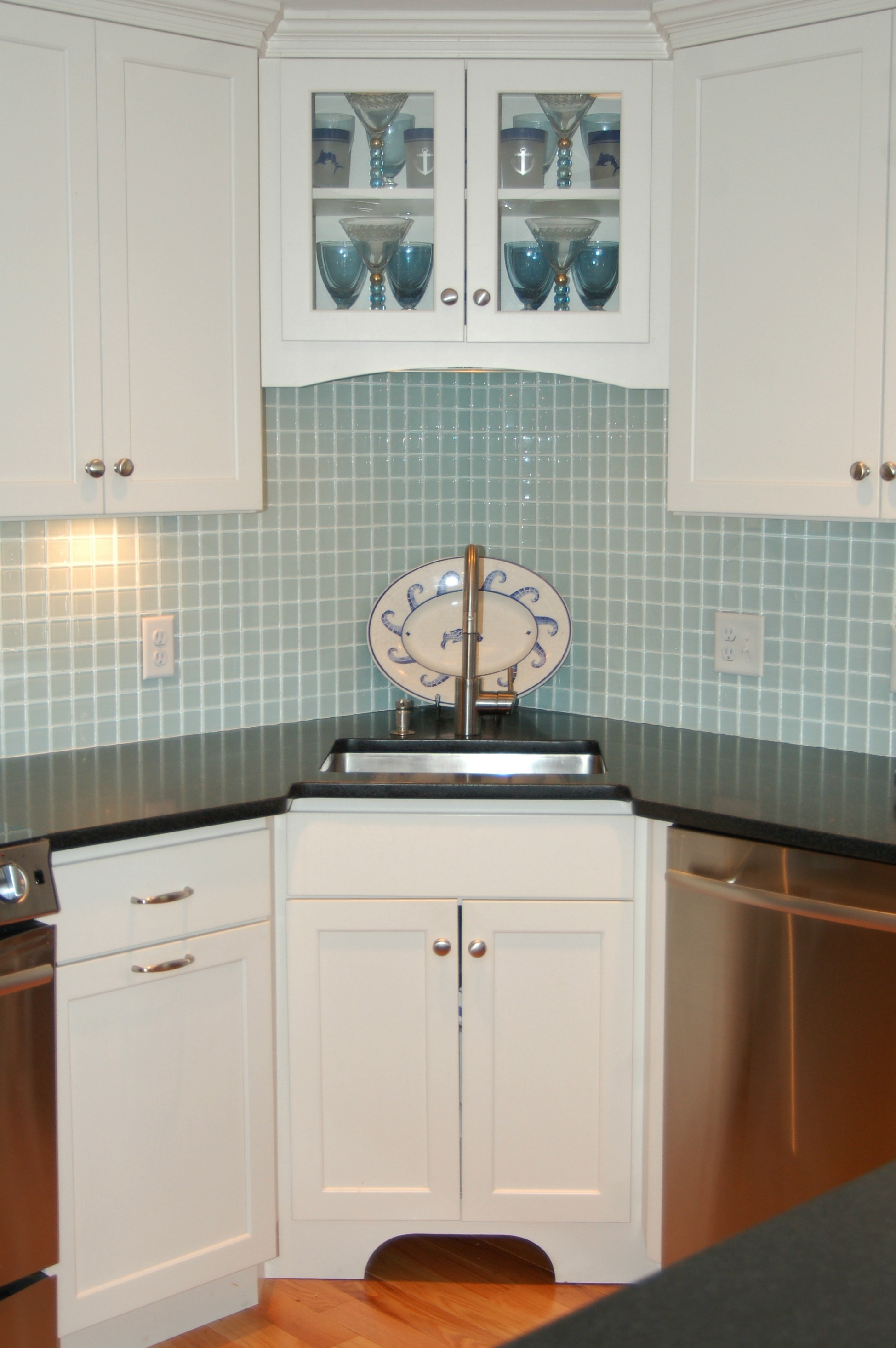
In this space, we used StarMark Cabinetry, Granite and Marble Countertops, and SubZero and Wolf Appliances.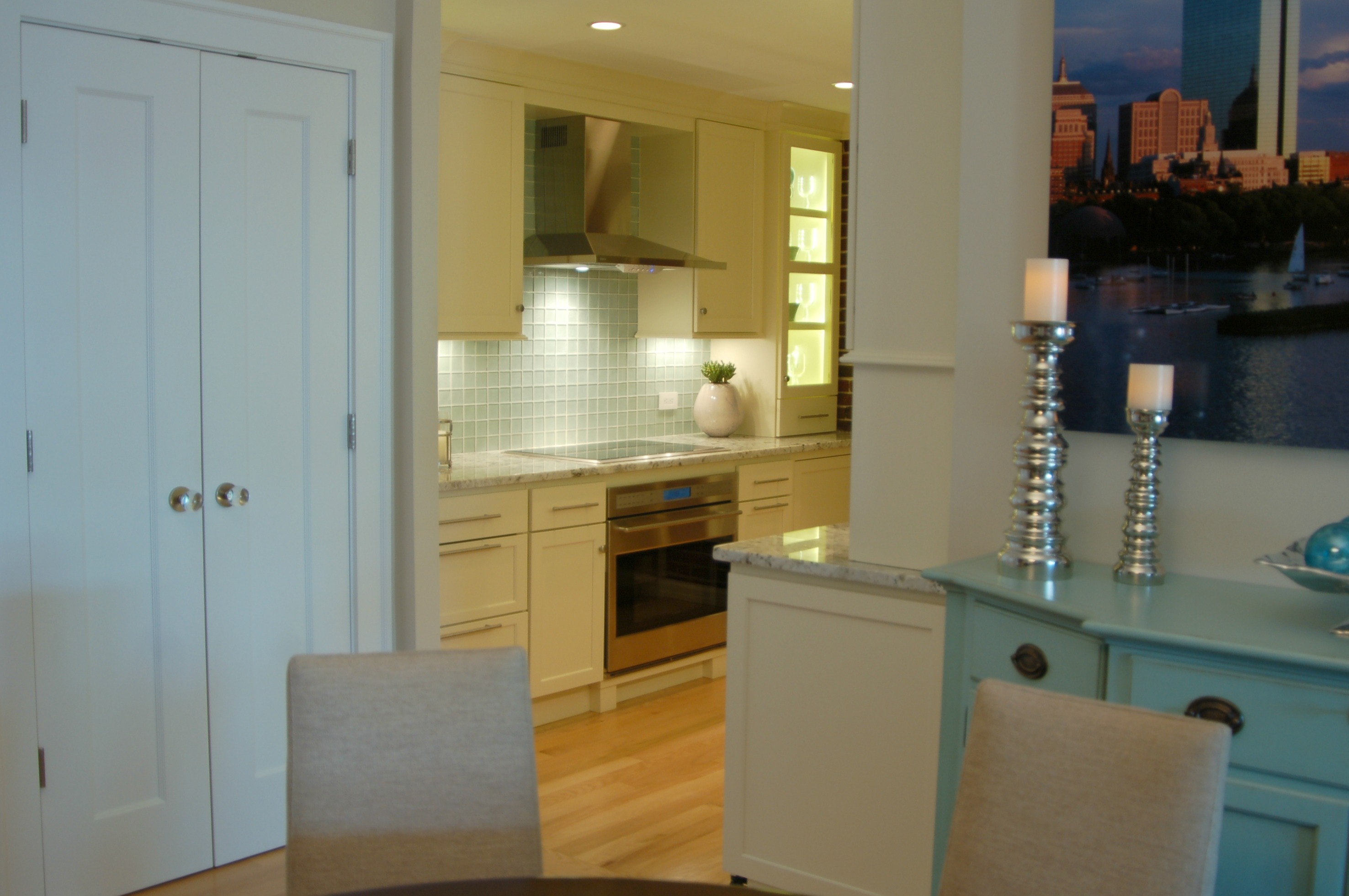

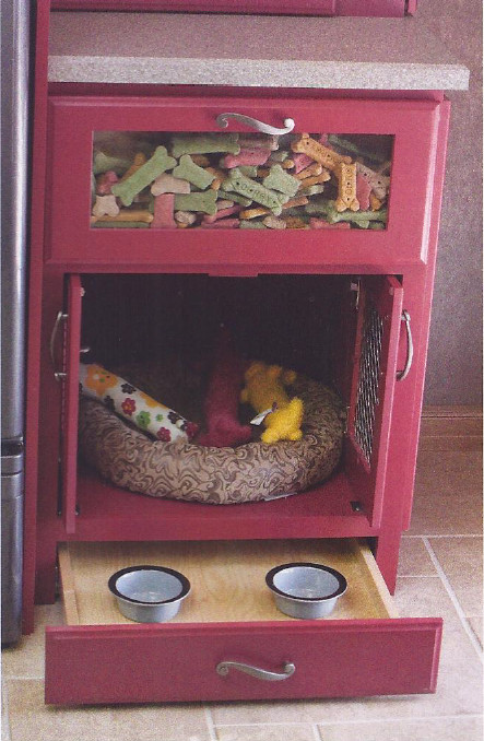
Concealed Microwave Cabinet (Pocket Door)
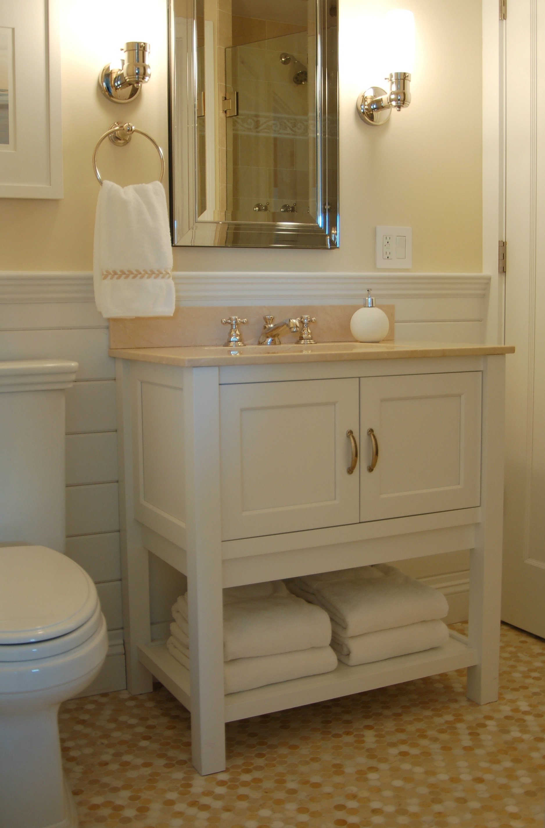
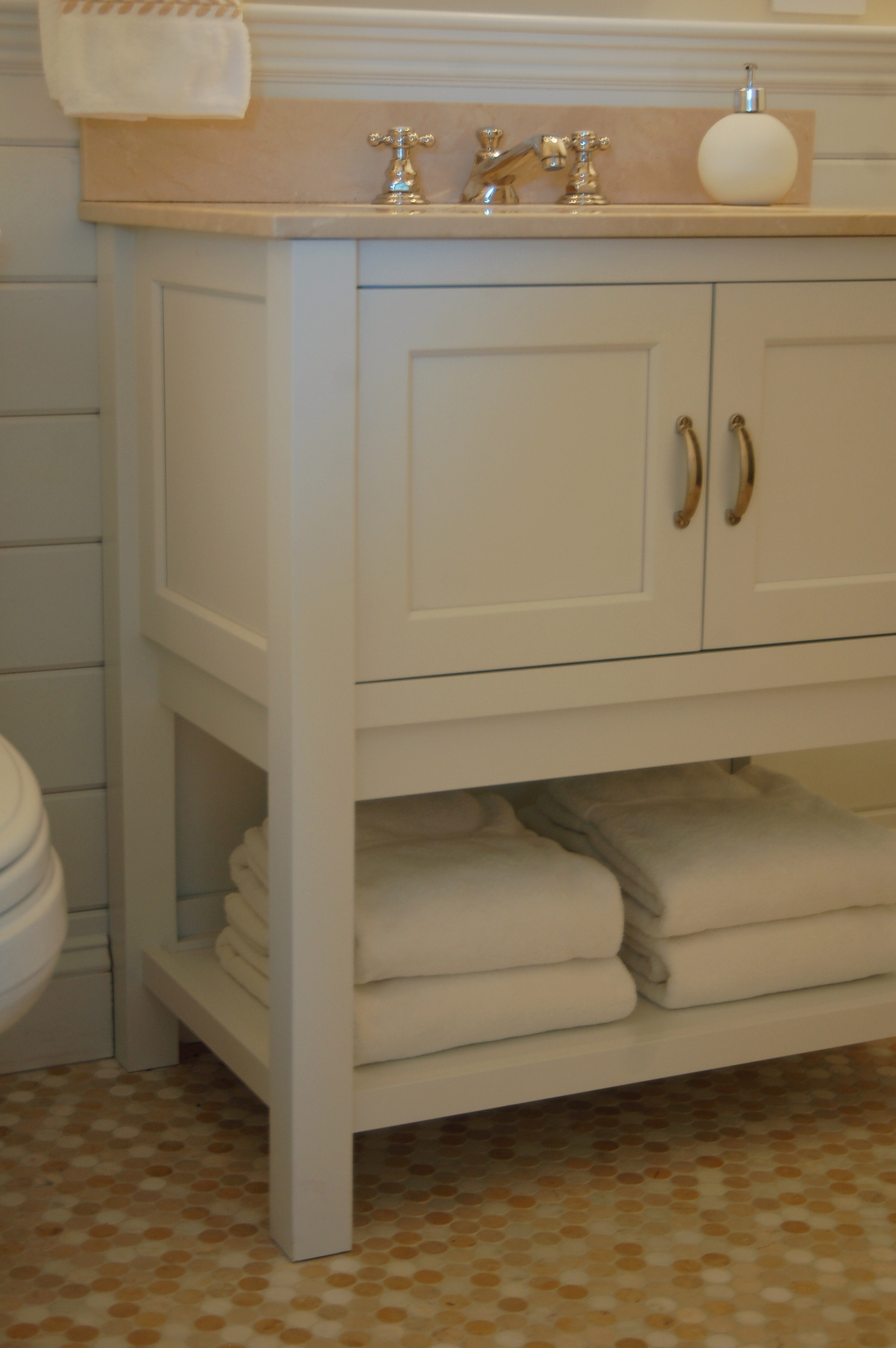
Master Bathroom
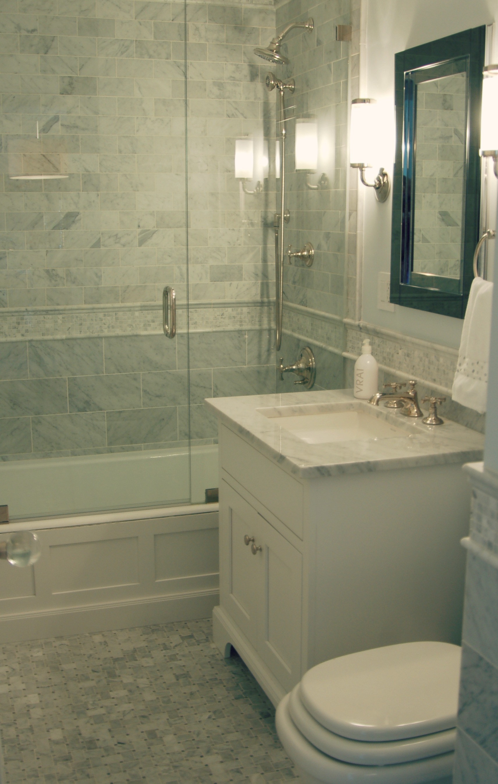
Guest Bathroom
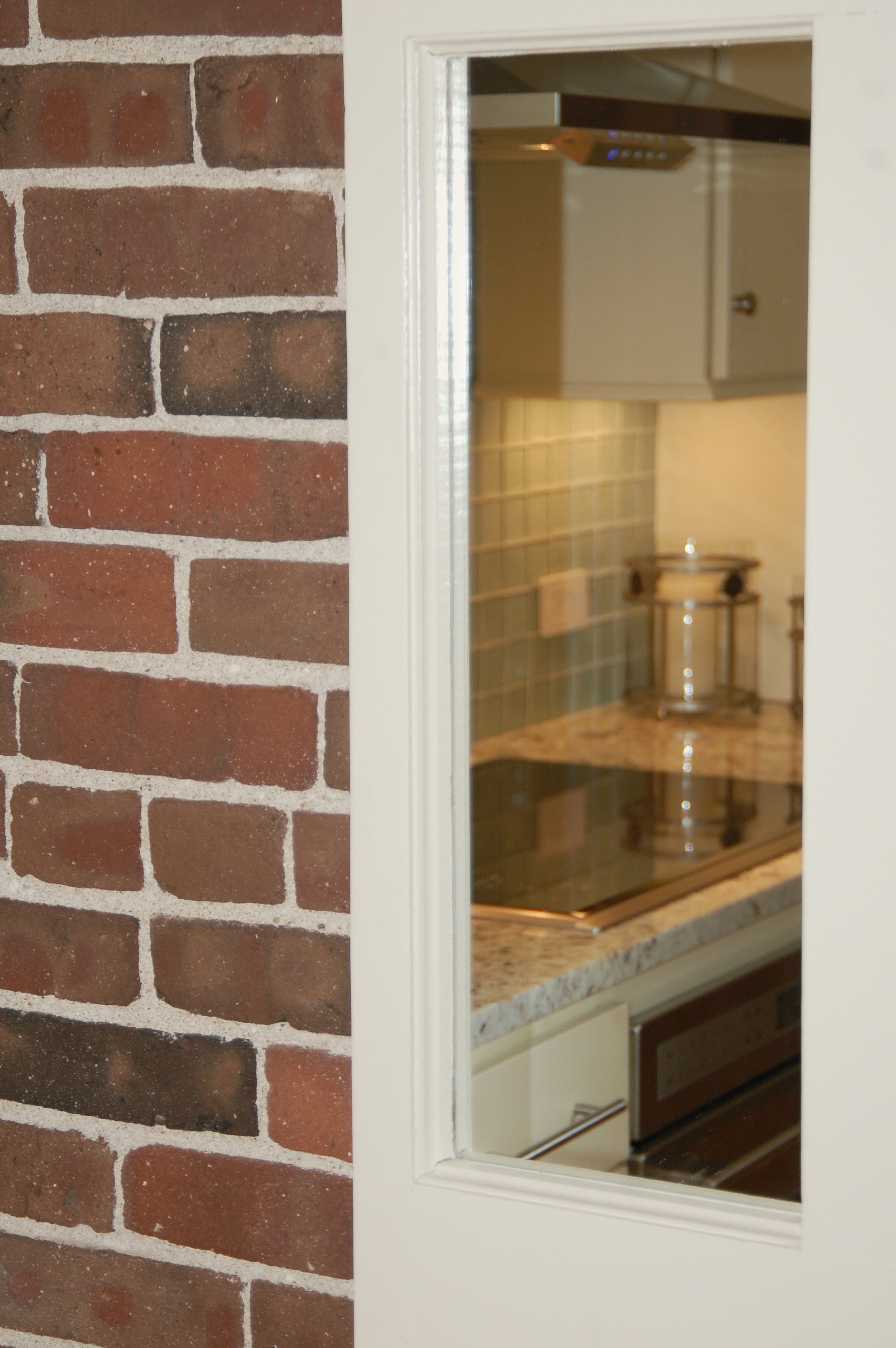
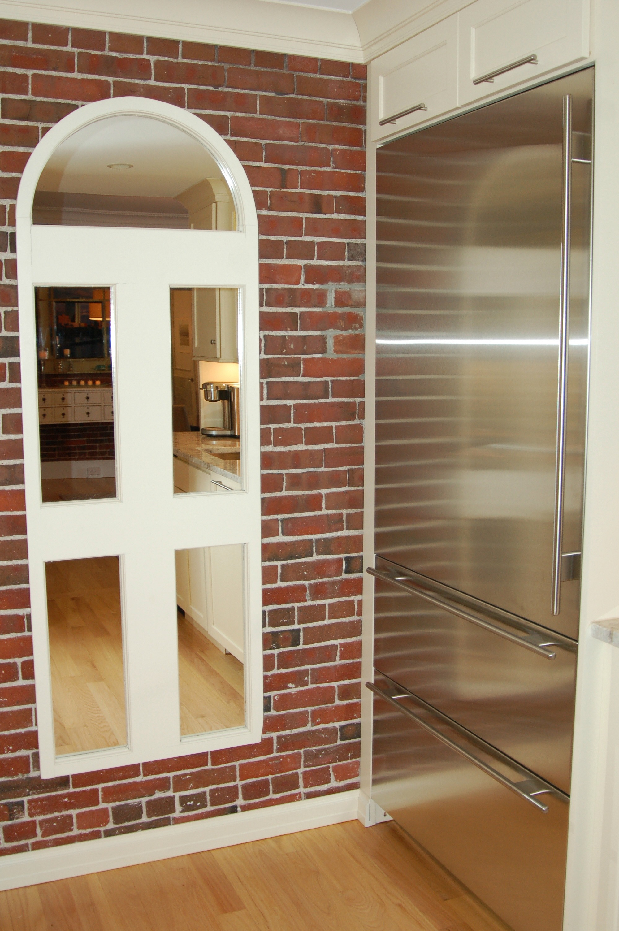
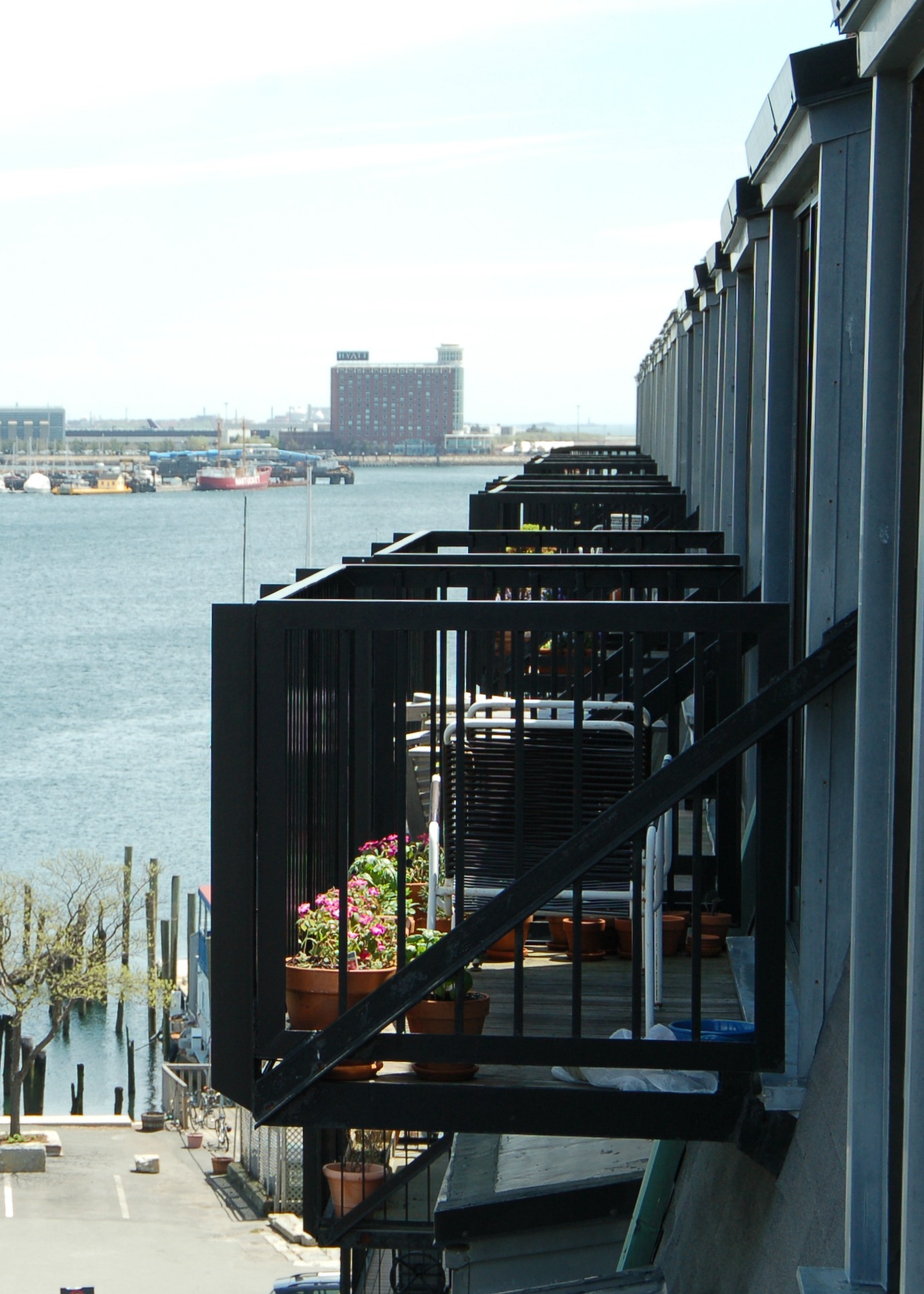
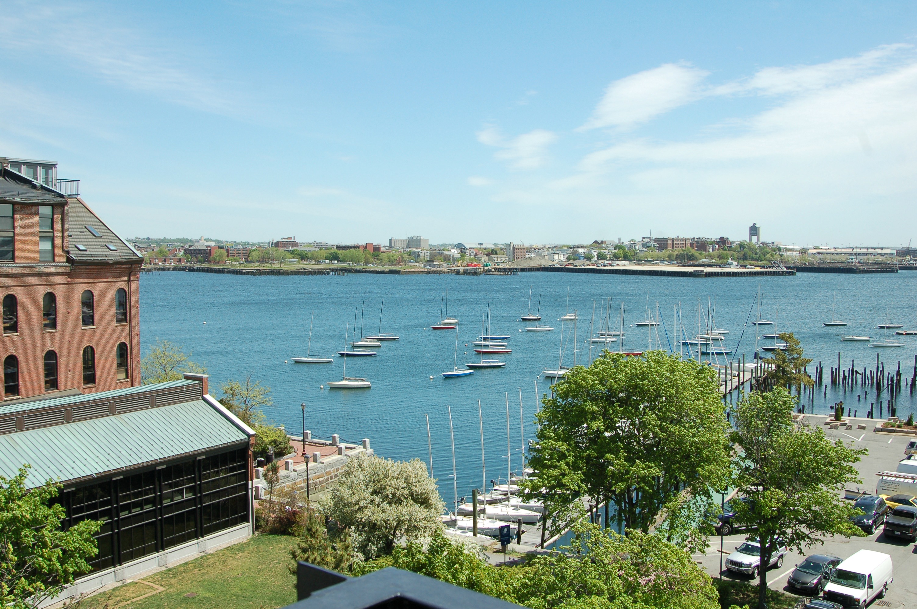
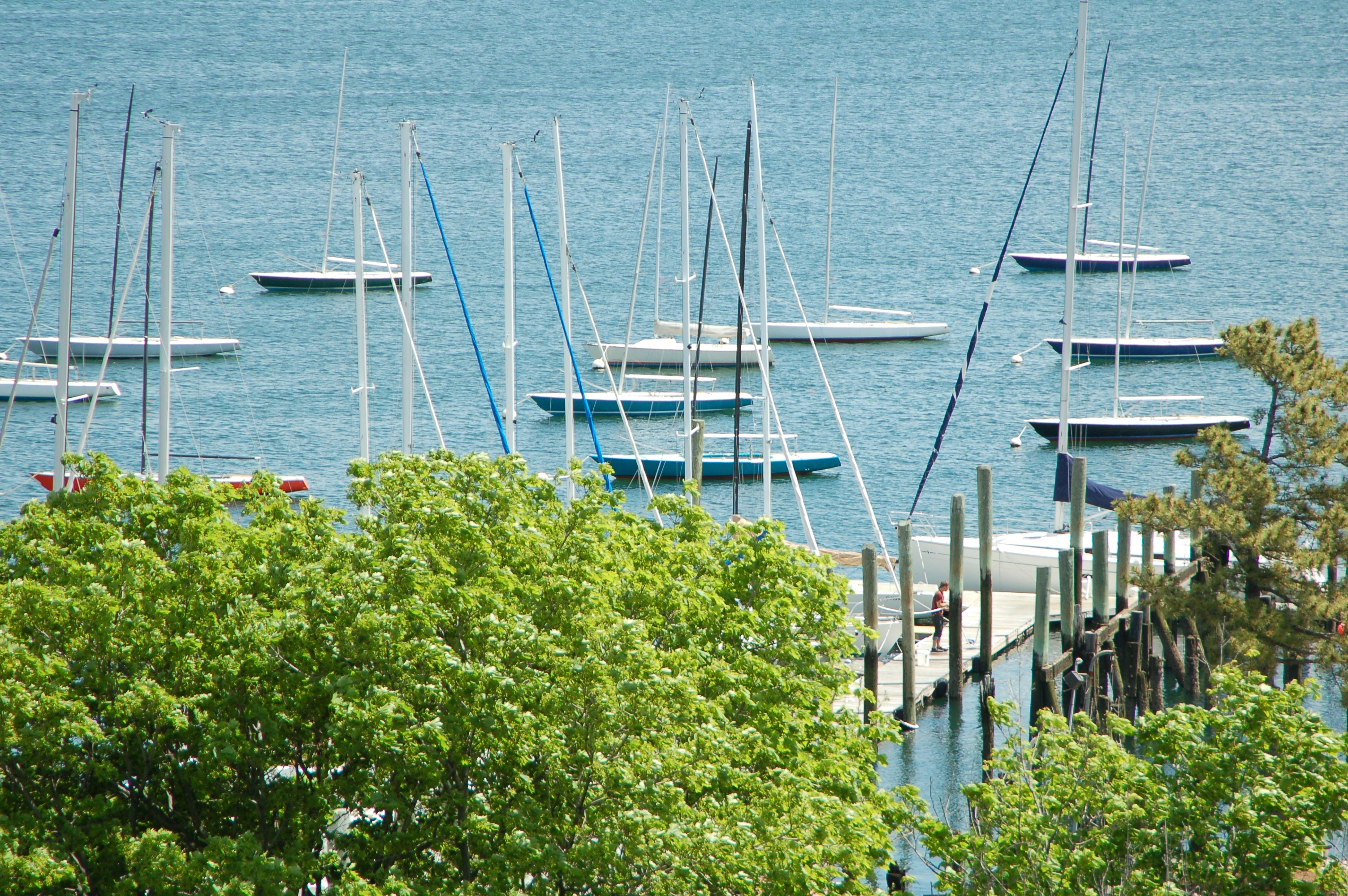
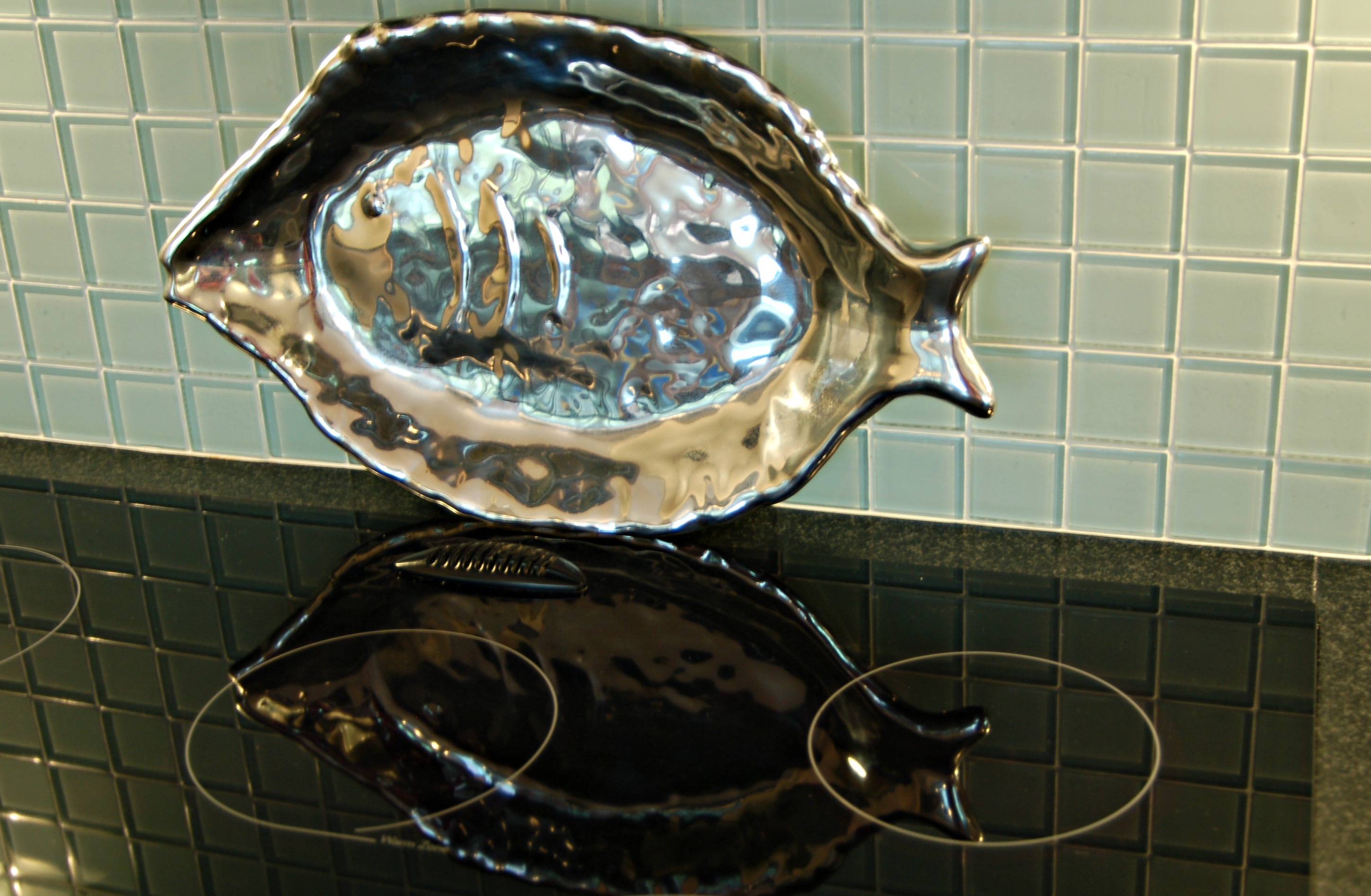
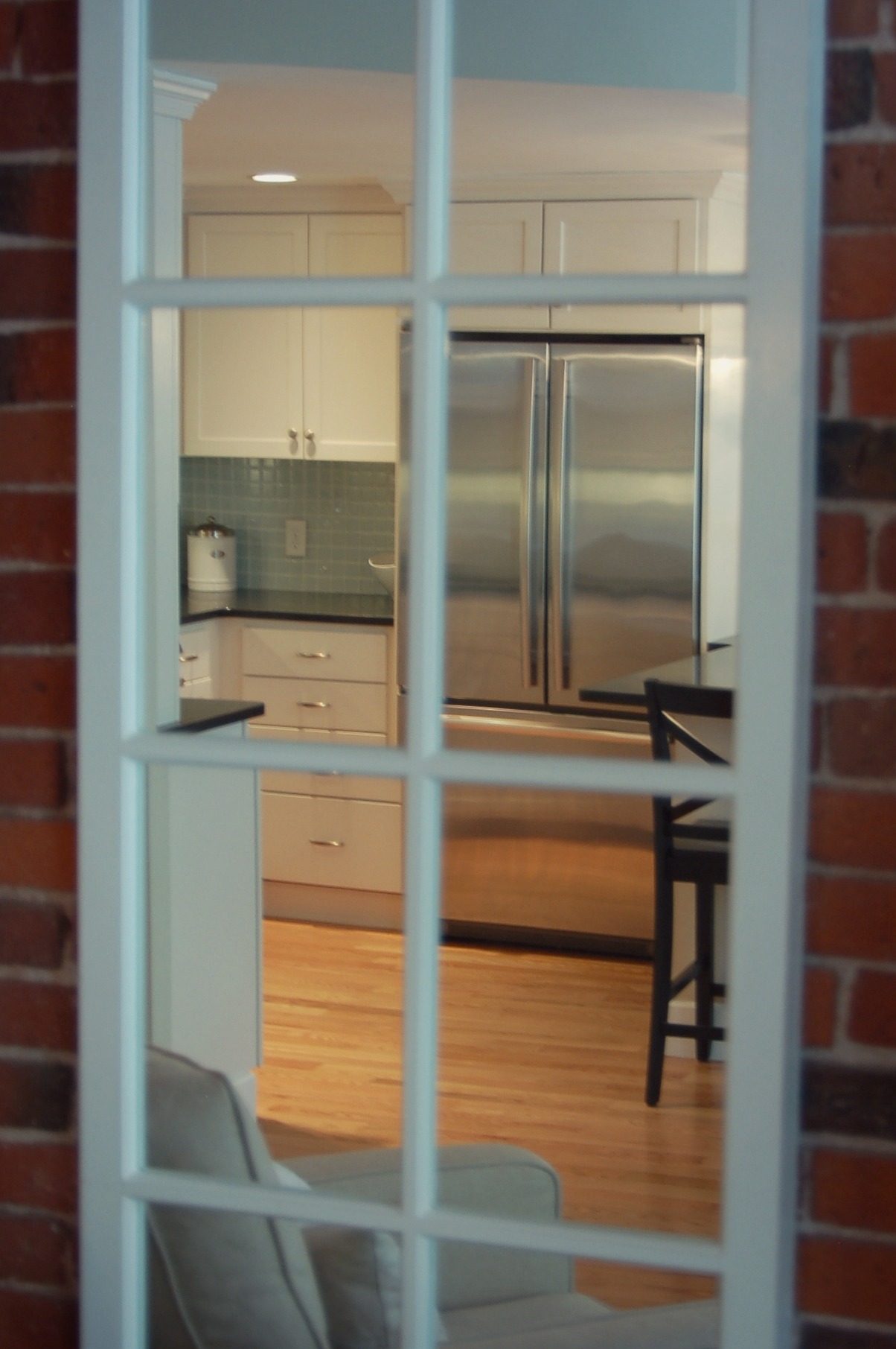
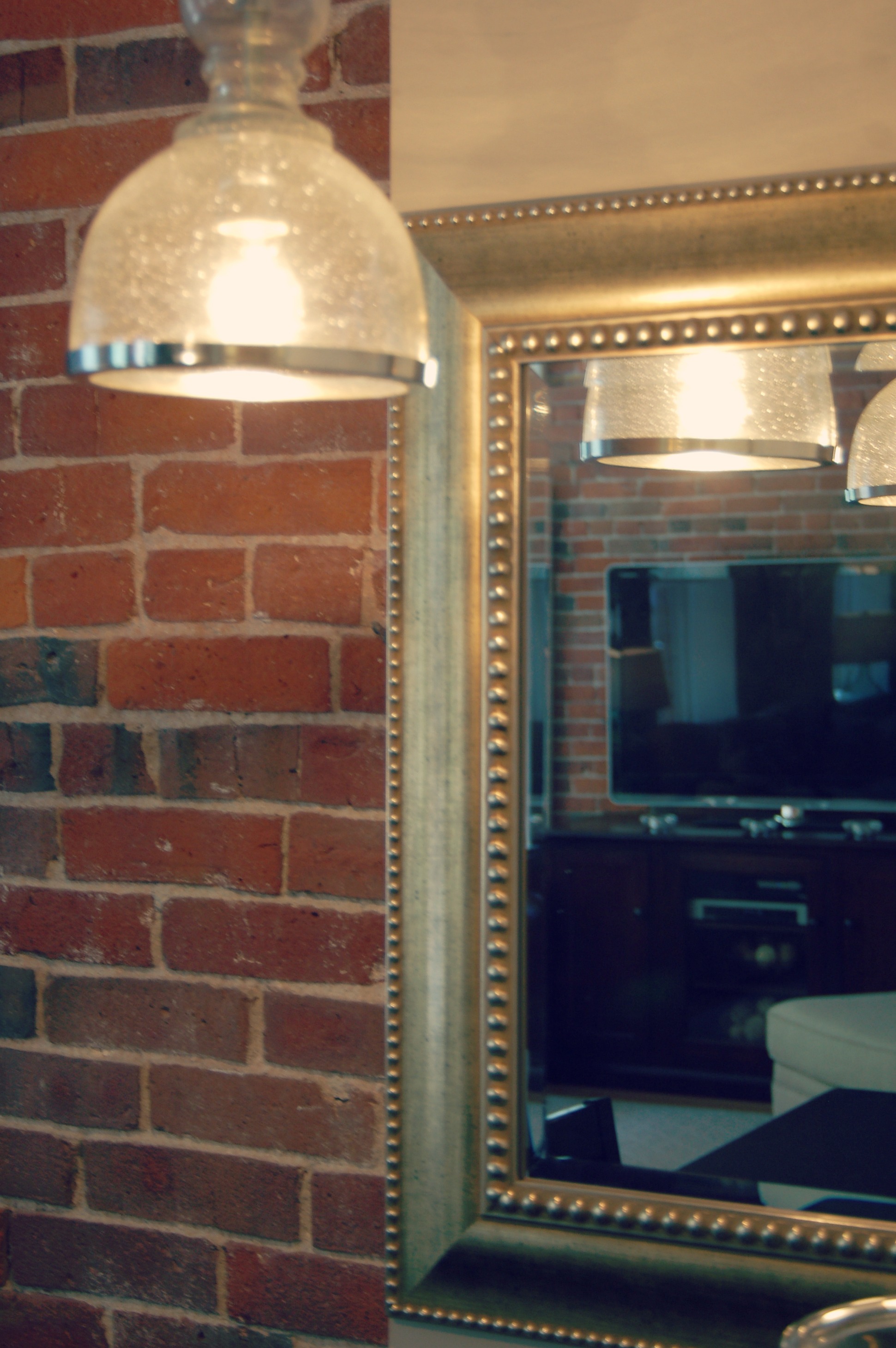
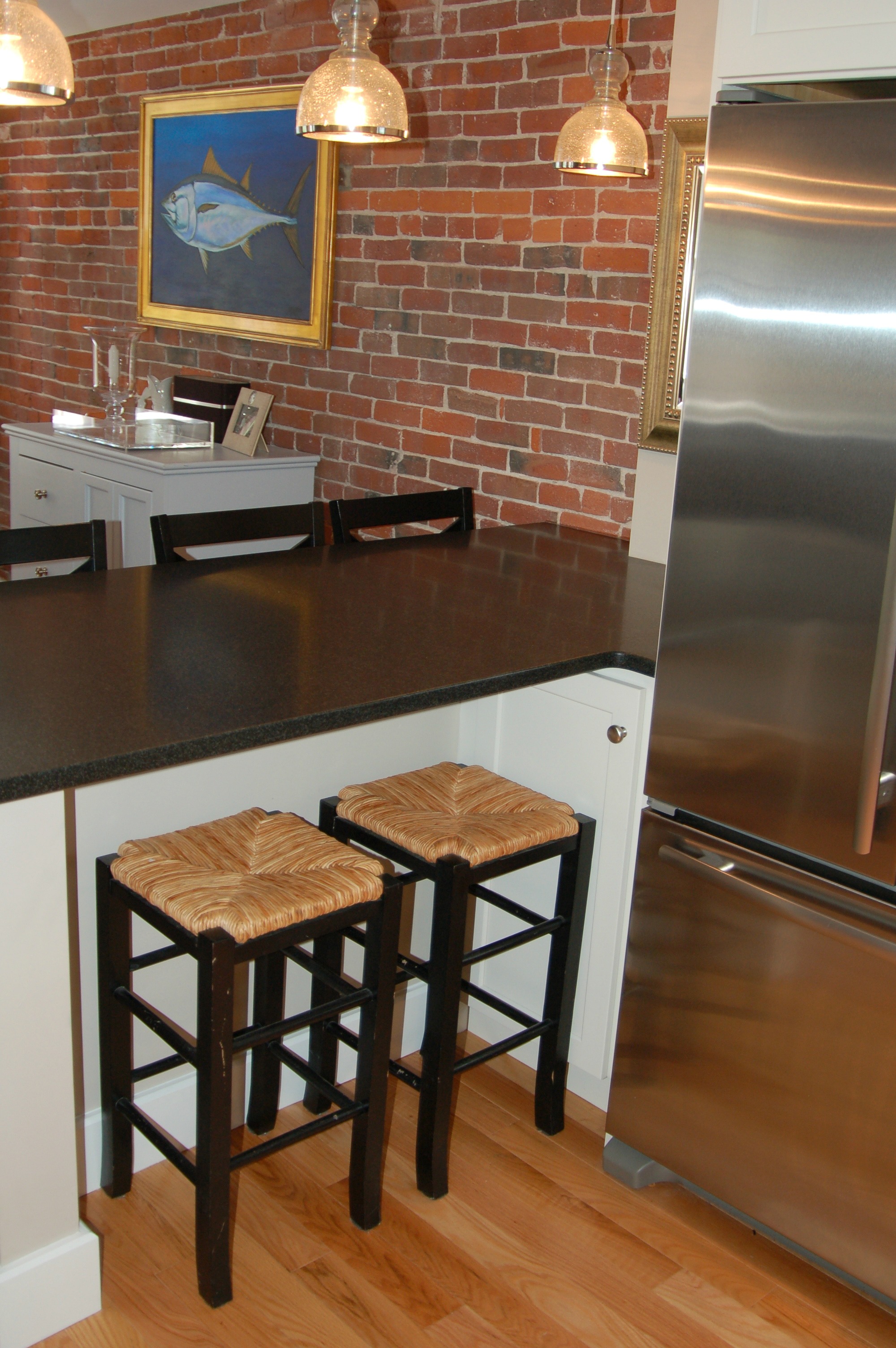
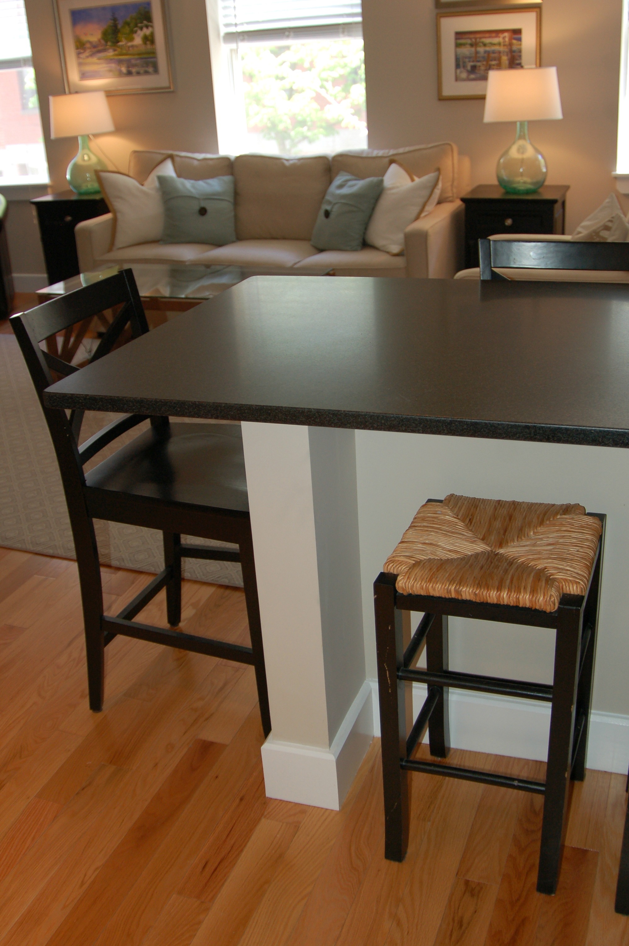
The view and other fun shots...

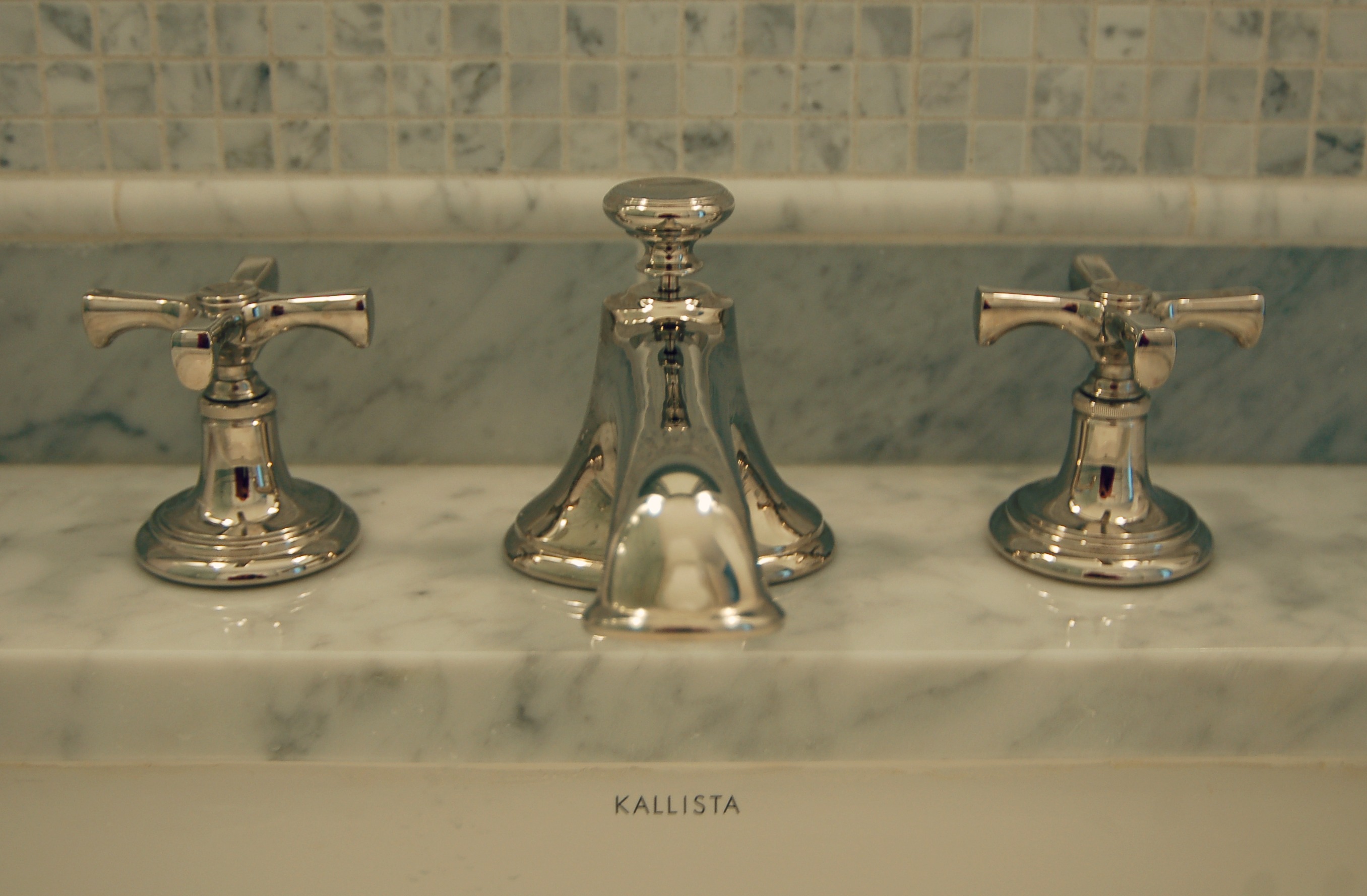
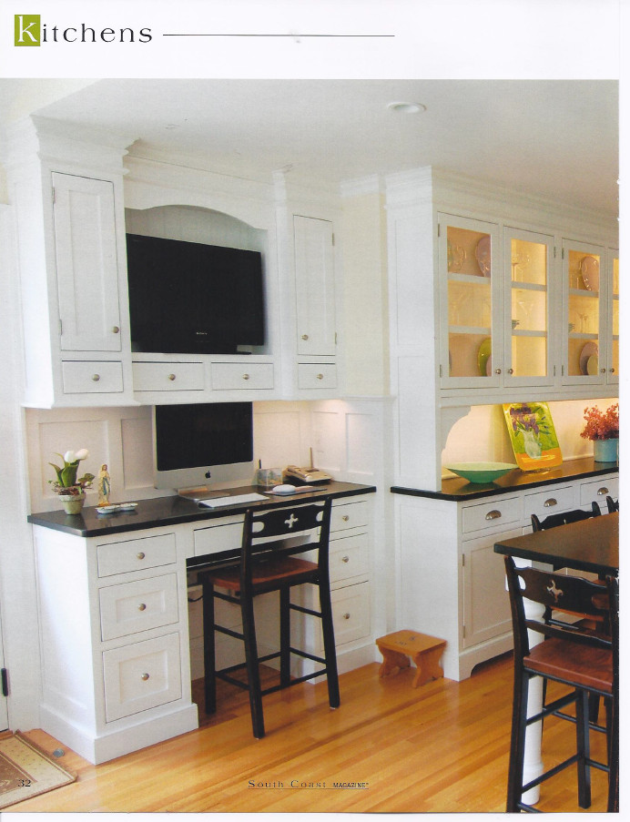
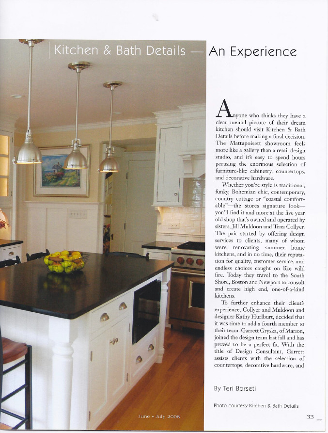
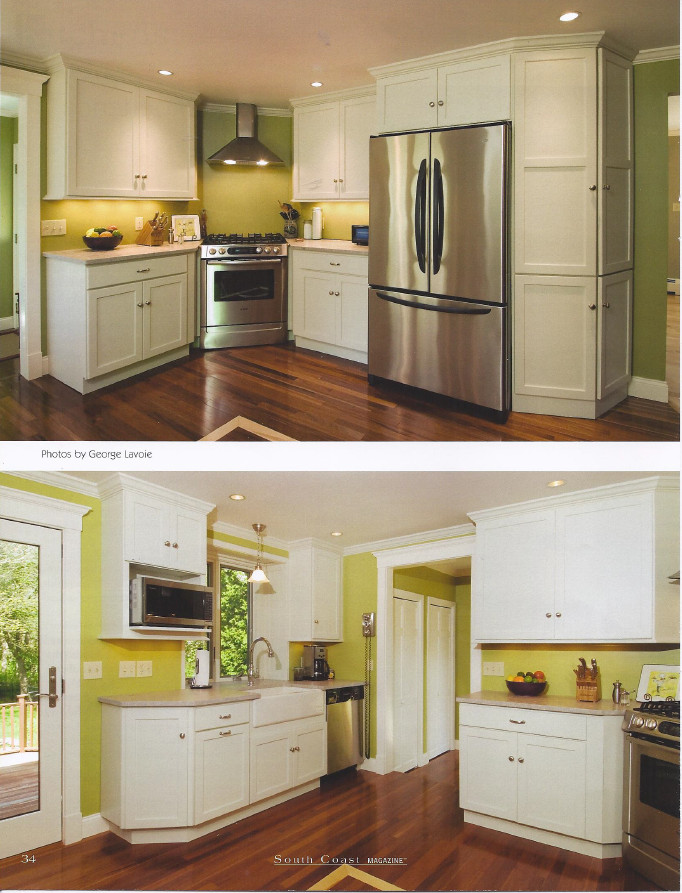
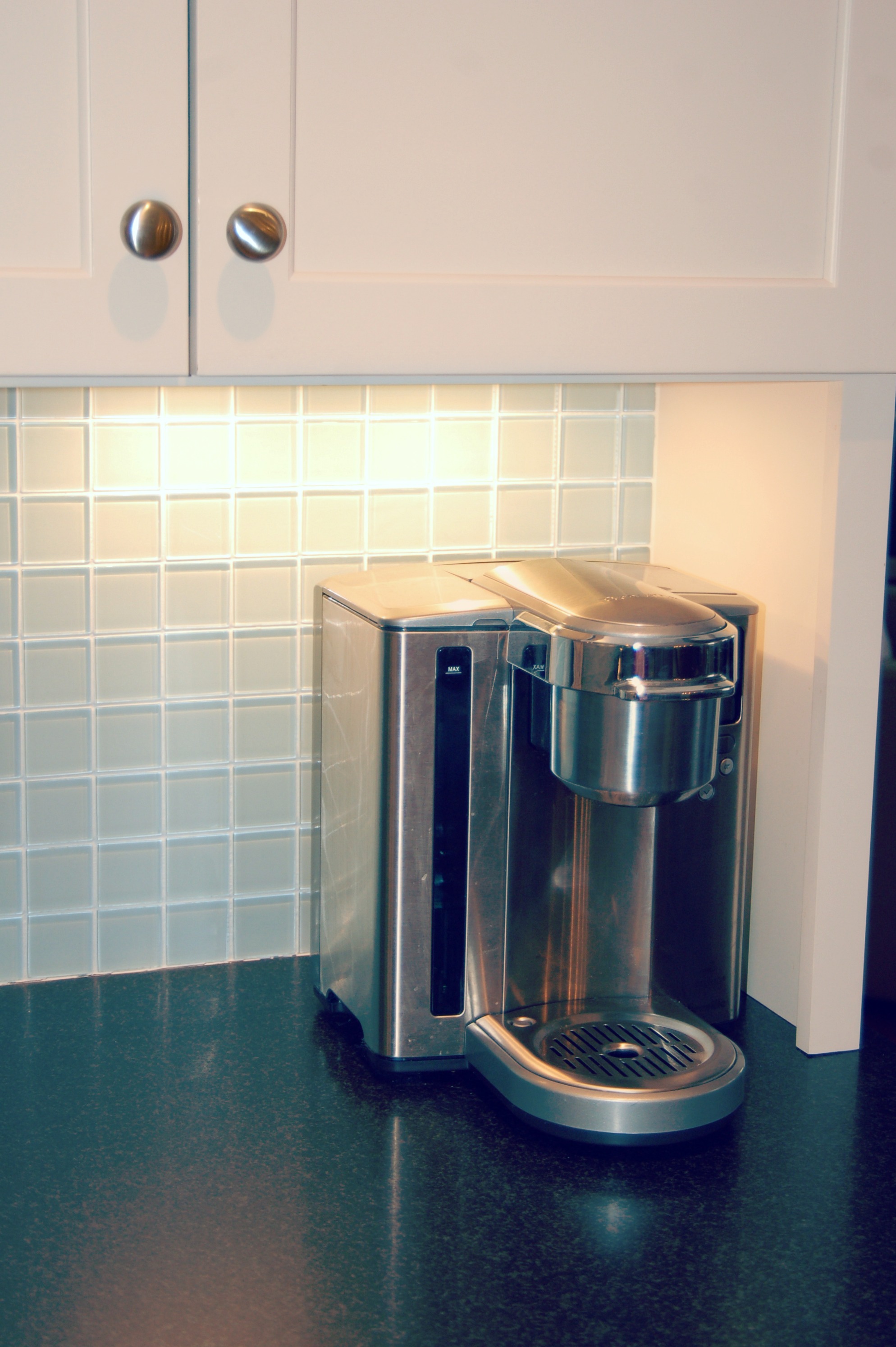
 Kitchen and Bath Details
