Contact Us
This form does not yet contain any fields.

    Located in the seaside town of Mattapoisett, our Kitchen and Bath Design showroom showcases multiple styles... from simple and classic to simply extraordinary.

    We are happy to showcase the largest selection of Plain and Fancy cabinetry door styles and finishes on the South Coast. We work with home owners, architects and builders to provide wood cabinetery and elegant finishing solutions. We cordially invite you to visit with us to discuss your next design project.


    Showroom Hours

    Tuesday - Friday:  9:30am - 5:00pm 

    Saturday:  9:30am-3:00pm

    Additional hours available by appointment


    Social Media


    Twitter
    KB Details Blog Stories

    Join Our Mailing List


    Email Marketing by CMPdigital

    Entries in StarMark Cabinetry (12)

    Tuesday
    Jul122011

    Integrating an Antique Slate Sink into a New Kitchen Design

    The “old” ….. like new

    When most people think of a “new” kitchen, they automatically think all of the elements are…. well, new. This isn’t always the case. I’ve designed entire kitchens around existing pieces such as a vintage range, butcher block top, and most recently, a gigantic double basin slate sink.

    My client was very specific about including the existing 5 foot long slate sink in her “new” kitchen. She felt that the sink would help retain some of the original cottage charm of the beach house. I couldn’t have agreed more! The slate sink created such a lovely counter-balance to the brand new painted cabinetry, modern appliances and Silestone countertop.

    Problem: The slate sink had seen a better day. It was stained and cracked from years of use. The sink also had an irregular shape on the bottom, most likely a result of accommodating the original base.

    Solution: We contacted our local stone fabricator and he agreed to remove the sink, painstakingly restore it to its original beauty, and then reinstall it into the new custom cabinet. When I designed the new base for the sink, I decided to conceal the funny shape on the bottom. This would eliminate the visual busy-ness therefore accentuating the clean lines of the rich black slate.

    All-in-all, I think it’s simply fabulous!

    Thursday
    Jun232011

    South Dartmouth Renovation...Before and After

    When Mike and Kevin walked into the Details showroom I knew right away I was going to love working with them. Their excitement and ideas made me immediately intrigued. They told me how they have a second home near the water in South Dartmouth which they needed to renovate. At the time, I don't think any of us knew how thorough the actual renovation was going to be. My first trip to their house was super informative! They had put a lot of effort into researching kitchen magazines and had photos and articles of things they liked and didn't like. They had a specific style in mind which they were able to clearly describe to me. It was apparent that functionality and design were both going to play an equally major role in their project. And just as important as those two aspects were, we, of course, had a well thought-out budget to stick to.

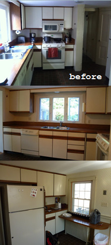
    My first step, as it is in 100% of the projects I work on, was functionality. Mike is the chef in the house, so giving him a prime prepping and cooking area was key. As you can see in the "before" photos, there wasn't much space for us to work with. I knew walls were going to be knocked down and new spaces would have to be made. The wall that originally separated the kitchen from the dining room was removed completely. We did, however, make sure to keep the built-in angled closet which was original to the house. What we were left with was a much more open space with a lot more light! In place of the removed wall, we built a knee-wall and brought it further into the dining room to create a better work flow within the kitchen. This knee-wall also gave us the perfect opportunity for Mike's peninsula cooking area. And, since Kevin is pretty handy in the kitchen, too, the added square footage made it comfortable for two people to work together.

    Entertaining was also a big factor to consider while space planning. The kitchen was so closed off from every other room of the house. It was also a narrow make-shift hallway from the mud-room entry to the rest of the house. To correct that problem, we opened up the wall from the mud-room to the kitchen and were able to almost double the width of that framed doorway. This made the two spaces start to feel more like one. The knee-wall I previously spoke about also lent a hand in creating an entertainment friendly home. On the back side of that peninsula I designed in a Sapele Mahongany bar. Now Mike and Kevin's guests can comfortably sit and converse while the two prepare meals. (A neat little side note: Mike and Kevin decided to repeat the Sapele Mahongany tops in the mudroom in order to blend the two spaces even more. It was a great move on their part!) You can see the amazing difference in the before and after photos! Where Mike (seated) and Kevin (standing) are in the "after" photo is nearly the exact location you see the side of the refrigerator in for the "before" shot.

    Remember when I said these clients came to me with a definite style in mind? Well that style was centered around double hung windows which were to be centered over the sink! There were no "Ifs," "Ands" or "Buts" about it! There would be 3 and they wouldn't be any smaller than what was there previously. I took Kevin and Mike through all the different ways this would impact their design. The biggest change was to the amount of wall cabinets. But by taking all the information I gave them into consideration they decided the window was more important. I am thrilled they did! The brightness of the white on white scheme is magnified by the light that comes through those windows. It is such a beautiful focal point and I truly believe it makes the kitchen what it is!

    After a lot of planned revamping came a lot of unplanned renovations. Once the contractor began demolition, structural problems and safety issues popped up. The project grew to a scale no one could have predicted. But, Mike and Kevin took it all on with the greatest mind-sets. They were patient, smart and strategic in their decision making. That, along with their fun and outgoing personalities, made for a very smooth and enjoyable project. The end result was a quality renovation with a fantastically fresh and airy style! It was an absolute pleasure working as their designer!


    ~Bethany~

    Tuesday
    Jun212011

    A Fabulous Testimonial! 

    Just wanted to share this lovely letter I received today from Bethany's clients.

    Dear Jill,

    We stumbled upon K&B D and it turned out to be wonderful thing. Our kitchen was to be the centerpiece of a whole-house renovation so it was very important to get it right.  We were introduced to Bethany and from the first meeting we knew we had found the right person to help us transform our kitchen.  She took time to understand our vision, priorities, and style.

    Bethany not only took the stress out of the process, she made it genuinely fun.  She gently guided us through the process while always respecting our budget.  She educated us thoroughly so we could make appropriate, intelligent upgrades and maximize functionality.

    The installation went equally well with Kathy.  She stepped in at the perfect time to work with our contractor and Bethany to identify and eliminate potential problems once the demolition was complete.  She was equal parts cheerleader and drill sergeant.  Both she and Bethany instilled confidence.

    Everything came together perfectly. Now that we have been using the kitchen for a couple of months, we can say that there isn't a thing we would change. We never thought we would be able to say that.  Everyone at K&B D was a pleasure to work with.  The end-result was a reflection of their attention to detail and the joy they take in the process of putting it together.  We wouldn't hesitate to recommend them. In a way, we are sad the project is over! 

    Sincerely,

    Kevin and Mike


    Thank you, Kevin and Mike, for being fabulous clients! We are so happy that you are enjoying your kitchen! It’s gorgeous!!!

    Stay tuned for Bethany's detailed blog about this project!

    Wednesday
    Mar232011

    Made in America

    After hearing about ABC’s “Made in America” program, I started thinking about our business and product offering. What is “Made In America”? 

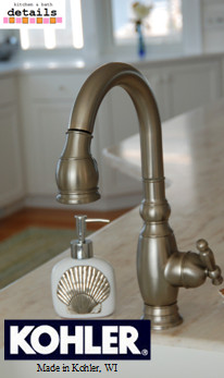
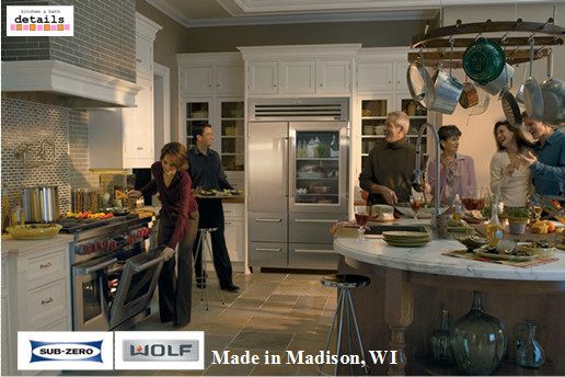
    I have great news! With the exception of some of our decorative hardware and plumbing companies, EVERYTHING we offer is MADE IN AMERICA!!!

    From Plain & Fancy Custom Cabinetry to SubZero & Wolf, we can literally make your entire kitchen and/or bathroom out of products made right here in the United States. What a great feeling to support OUR country!

    So, next time you go to make a purchase, think about where it's made. You can make a difference and support our country too!

    Friday
    Oct152010

    A Fabulous Alternative to Marble Countertops

    Marble countertops... GORGEOUS!!! Marble countertops in a kitchen, not such a good idea. So many times I have clients come in and just completely fall in love with the look of marble. And, of course, I can't blame them. It is a beautiful natural stone. The colors and movement are exquisite. But, the maintenance and cautiousness that it takes to keep the stone looking up to its full potential is immense. Each time I have the countertop conversation with a client, I try to make one point as clear as I can. Marble is not for a home or a family that doesn't want to consciously have their countertop's "well-being" in mind at all times. (Please don't think I'm saying "no" to marble all together. In the right application, in the right home, it is superb!)

    A few months ago I started a project in Marion for a couple with young kids. The wife adored Carera Marble and so badly wanted to make it the countertops in her kitchen. After having the above conversation, we decided the upkeep was not for her nor the rest of her family. With that said, we moved on to other options. In the end, she and her husband agreed on a phenomenal stone called White Zito. It has the graceful, organic movement of marble and the colors couldn't be more perfect. So, we were able to get the look she was after without having to stop all red wine and/or kool-aid drinking in and around the kitchen island! The kitchen was installed last month and my clients are thrilled!


    For more articles about putting marble in your kitchen, I found the following website: http://kitchen-counter-tops.net/marble/index.php . It seems to be super helpful and has a wealth of information! Or, stop in at Details to see me and our countertop sample room!

    ~Bethany~