 When Mike and Kevin walked into the Details showroom I knew right away I was going to love working with them. Their excitement and ideas made me immediately intrigued. They told me how they have a second home near the water in South Dartmouth which they needed to renovate. At the time, I don't think any of us knew how thorough the actual renovation was going to be. My first trip to their house was super informative! They had put a lot of effort into researching kitchen magazines and had photos and articles of things they liked and didn't like. They had a specific style in mind which they were able to clearly describe to me. It was apparent that functionality and design were both going to play an equally major role in their project. And just as important as those two aspects were, we, of course, had a well thought-out budget to stick to.
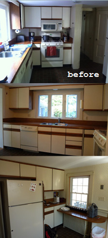
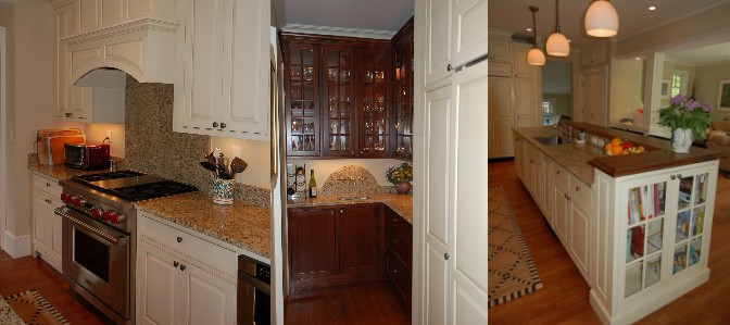
My first step, as it is in 100% of the projects I work on, was functionality. Mike is the chef in the house, so giving him a prime prepping and cooking area was key. As you can see in the "before" photos, there wasn't much space for us to work with. I knew walls were going to be knocked down and new spaces would have to be made. The wall that originally separated the kitchen from the dining room was removed completely. We did, however, make sure to keep the built-in angled closet which was original to the house. What we were left with was a much more open space with a lot more light! In place of the removed wall, we built a knee-wall and brought it further into the dining room to create a better work flow within the kitchen. This knee-wall also gave us the perfect opportunity for Mike's peninsula cooking area. And, since Kevin is pretty handy in the kitchen, too, the added square footage made it comfortable for two people to work together.
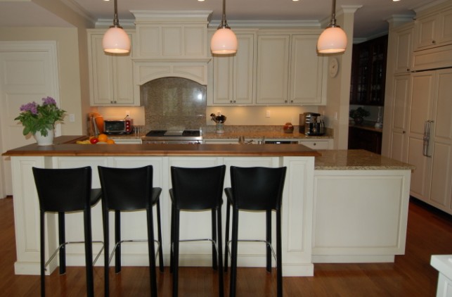
 Entertaining was also a big factor to consider while space planning. The kitchen was so closed off from every other room of the house. It was also a narrow make-shift hallway from the mud-room entry to the rest of the house. To correct that problem, we opened up the wall from the mud-room to the kitchen and were able to almost double the width of that framed doorway. This made the two spaces start to feel more like one. The knee-wall I previously spoke about also lent a hand in creating an entertainment friendly home. On the back side of that peninsula I designed in a Sapele Mahongany bar. Now Mike and Kevin's guests can comfortably sit and converse while the two prepare meals. (A neat little side note: Mike and Kevin decided to repeat the Sapele Mahongany tops in the mudroom in order to blend the two spaces even more. It was a great move on their part!) You can see the amazing difference in the before and after photos! Where Mike (seated) and Kevin (standing) are in the "after" photo is nearly the exact location you see the side of the refrigerator in for the "before" shot.
Remember when I said these clients came to me with a definite style in mind? Well that style was centered around double hung windows which were to be centered over the sink! There were no "Ifs," "Ands" or "Buts" about it! There would be 3 and they wouldn't be any smaller than what was there previously. I took Kevin and Mike through all the different ways this would impact their design. The biggest change was to the amount of wall cabinets. But by taking all the information I gave them into consideration they decided the window was more important. I am thrilled they did! The brightness of the white on white scheme is magnified by the light that comes through those windows. It is such a beautiful focal point and I truly believe it makes the kitchen what it is!
After a lot of planned revamping came a lot of unplanned renovations. Once the contractor began demolition, structural problems and safety issues popped up. The project grew to a scale no one could have predicted. But, Mike and Kevin took it all on with the greatest mind-sets. They were patient, smart and strategic in their decision making. That, along with their fun and outgoing personalities, made for a very smooth and enjoyable project. The end result was a quality renovation with a fantastically fresh and airy style! It was an absolute pleasure working as their designer!
~Bethany~


 Kitchen and Bath Details