Contact Us
This form does not yet contain any fields.

    Located in the seaside town of Mattapoisett, our Kitchen and Bath Design showroom showcases multiple styles... from simple and classic to simply extraordinary.

    We are happy to showcase the largest selection of Plain and Fancy cabinetry door styles and finishes on the South Coast. We work with home owners, architects and builders to provide wood cabinetery and elegant finishing solutions. We cordially invite you to visit with us to discuss your next design project.


    Showroom Hours

    Tuesday - Friday:  9:30am - 5:00pm 

    Saturday:  9:30am-3:00pm

    Additional hours available by appointment


    Social Media


    Twitter
    KB Details Blog Stories

    Join Our Mailing List


    Email Marketing by CMPdigital

    Friday
    Aug272010

    Kitchen Design Ideas for Display Space

    Tena’s thoughts on display spaces…..How much is too much?

    Display space is an important factor to consider while designing a new kitchen.  A knowledgeable Designer should always recall the old adage “to each His own” while contemplating display spaces within a kitchen plan.

    There’s a multitude of reasons why people might choose open / glass covered display spaces. 
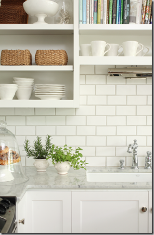
    Display Open shelving or glass fronted cabinetry can provide space for someone to display their pottery collections, artwork or cookbooks.  Keeping these items in clear sight can provide easy access as well as an artful pop of color.

    Ambiance Lighting Glass fronted cabinetry is a great place to add some accent lighting.  Interior lights can add “sparkle” to crystal stemware, provide a soft “night-light” effect, or with a soft blue hued two-tone interior- a glow reminiscent of sea glass.

    Visual Minimization Kitchen spaces have been gradually getting larger and I have found that simply filling the entire space with solid front cabinet doors can become overwhelming.  One way to “break-up and lighten” these visually cumbersome areas would be to inject the appropriate amount of display spaces.  For example, flanking a large window or range area with glass fronted cabinetry or lining the back of an island with open bookcases can soften the space.
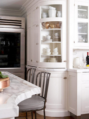
    Visibility Sometimes the amount of open display space strictly depends on a Client’s need for function.  Some Clients do a great amount of entertaining friends and family (especially in summer homes) and the thought of having everything easily identified behind glass doors is appealing. When designing my own kitchen I chose to make all of my wall cabinetry glass. Although, having all glass doors has its pitfalls. If you’re like me keeping these cabinets neat and tidy could become a full-time-job. It could also mean a trip to Crate and Barrel for some new (matching) dinnerware. It would be a shame to be displaying those “worlds greatest golfer” mugs for the world to see.

    Restoration-Renovation Open display spaces are frequently found in older homes. Historically, display spaces could appear as open shelving in a walk-in pantry or functional kitchen, counter-to-ceiling sliding glass doors in a formal Butler’s pantry, or corner cupboards in a Dining area. I tend to include many of these design elements while designing a new space in an antique restoration project. These elements help  reflect the period of the home and showcase the original architectural character.

    Just remember, whether you like to hide (most of your stuff) behind closed doors or flaunt-it-if-you’ve-got-it, display spaces can definitely enhance an overall kitchen space……”To each His own”!

    Thursday
    Aug192010

    Retro Kitchen Appliances

    Yesterday I was looking through a Coastal Living Magazine and saw a home with a refrigerator that had belonged to the owner's grandmother. The woman had it brought up from her basement and refurbished so that she could use it in her summer home. I thought that was such a cool idea! Not only was it sentimental for the home owner, but it also looked super cool. Knowing that not all of us are lucky enough to inherit such a cool heirloom, I did a little research. I found a company, called Big Chill , that not only makes retro refrigerators, but other appliances, too. Now, you definitely have to be 100% committed to the vintage look, but by using appliances like this you can really give your kitchen a punch of 1952! Whether you want to just give your kitchen a simple touch of this retro style OR you want to make the whole kitchen feel like a blast from the past, the Big Chill is one option that does the trick. You could even add a pop of color by mixing a kitchen full of modern stainless steel appliances with a vibrant refrigerator or range. Either way, know that by adding something a little different to your kitchen is what separates it from every other kitchen out there!!

    ~Bethany~


    Friday
    Aug062010

    Decorative Hardware... The Jewelry for your Kitchen

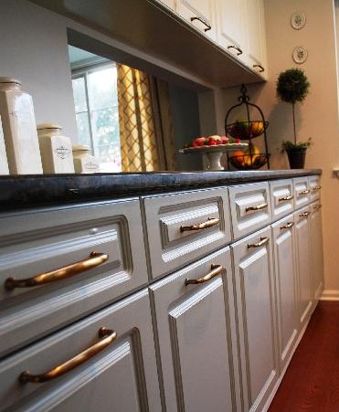
    Imagine getting all dressed up for a night on the town. You've got it all... new dress, gorgeous shoes, fabulous hair... and no earrings. Actually, lets take it a step further... no jewelry at all. What?! That is just absurd! Well, think about your kitchen cabinetry the same way. A kitchen without the final touches of hardware is, well, naked.  Although it may be the smallest part of a kitchen, the hardware can truly make it or break it.  As you see here in this photo to the left, the linear brass pulls simply gives a very vintage feel to the cabinetry without going overboard. However, one could easily change out these traditional looking pulls for some square polished chrome knobs and take the entire kitchen's style in a whole new transitional direction.

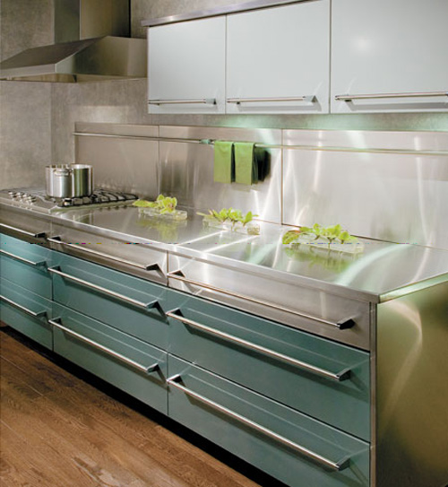
    The next example shows very sleek linear hardware. Here, the cabinetry's lines had already developed the clean simplistic style. The addition of such bold pulls successfully completes the overall modern feeling.

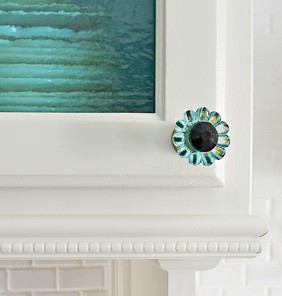
    In the last photo to the left, these sassy glass knobs are whimsical and airy. But, at the same time, they are also adding a slight touch of "coastal freshness" to the look. In addition, the standard panel door has been modified to a colorful glass door.

    As you can see, the hardware does a LOT when it comes to really making a design cohesive. Don't let them become an afterthought! The addition of these little "gems" is priceless when it comes to pulling the look of the kitchen together.

    We have an amazing gallery of decorative hardware here at our showroom! Come in and check it out!! Also, If you mention my blog, we'll give you 15% off of your hardware order!!!

    ~Bethany~ 

    Tuesday
    Aug032010

    House Beautiful's Kitchen of the Year - 2010

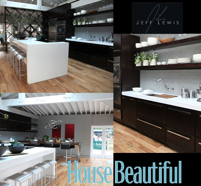
    I was ecstatic to hear that Jeff Lewis would be the designer for House Beautiful’s Kitchen of the Year! We are huge fans of Jeff at Details and often use his Bravo TV show “Flipping Out” as a common water cooler conversation. We rarely get the opportunity to design with contemporary styling in our area, so admiring his projects can be a breath of fresh air.

    For me, Jeff does an amazing job making contemporary design appealing to someone with traditional taste.  The key is keeping things clean.  I think we can thank his OCD for this talent. Overcrowding with props and/or countertop appliances can definitely ruin a look – especially when working with contemporary design.  The open shelving, for example, looks fantastic with just basic white dinnerware and plain glass stemware.  A pop of color with natural objects, like flowers or plants, are also a great idea to keep things simple and less distracting to the eye.  To add something a little bit punchy… my favorite “pop” of color in any kitchen would be the illustrious red knobs on a Wolf range. What a statement!

    We can’t wait to see what Jeff has in store for us when the new season of “Flipping Out” begins on August 10th.  Check it out!!!

    ~Jill~


    Wednesday
    Jul212010

    Transitional Kitchen Design

    In the design community, contemporary style and European influence has seemingly taken over in the past 10 years or so. Hard lines and angles have been used with cold materials and colors to accomplish an almost naked look. This commercial style was not only being designed for offices and public spaces, but also private homes. However, recently I've been noticing a surge of warmth showing itself in mainstream design. For so long, I think people were missing a very important part of how a home should feel... comfortable.

    Now, those same people are thoughtfully embracing color and softness into their spaces. The outcome? A transitional style that meets traditional and contemporary in the middle. The overly intricate details of a traditional style have been toned down while the colors and textures have been enhanced. The clean lines of contemporary designs have still been embraced, however, the materials and textiles used are warming up the look. And, of course, no design trend can change without affecting the kitchen design field!

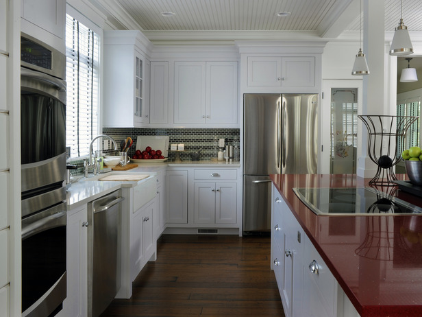
    For example, with HGTV's 2010 Green Home came a refreshing dose of transitional design. The kitchen flaunts beautiful framed inset cabinetry with great vintage cup pulls, which is all quite traditional looking. However, the doors are simplified by their shaker style and crisp white finish while the cup pulls tie in with the new (and modern!) stainless steel appliances. The warmth of the wood flooring makes for a perfect contrast with the red quartz island countertop. The chunky crown moulding with its' simplified profile meets the traditional bead board ceiling seamlessly. All of this, along with many other details, lends itself to the comfortable and fresh feeling style that is Transitional Design.

    What are your thoughts on this design style?

    ~Bethany~